Nakagin Capsule Tower: The Future of Compact Living, circa 1972

Don’t let its weathered facade fool you, the Nakagin Capsule Tower was one of the most innovative architectural designs of its day. Designed by architect Kisho Kurokawa, the Tokyo tower was completed in 1972 and the crown jewel of the Japanese “Metabolism” school, which, according to Wikipedia held a vision “for cities of the future inhabited by a mass society [that was] characterized by large scale, flexible, and expandable structures that evoked the processes of organic growth.”

nakagin-interior

While many architectural concepts like this never see the light of day, the Tower was (and continues to be) the real deal. Each of the 140, 90 sq ft living capsules was detachable from two main concrete towers; you could also join smaller units to make bigger ones. It was expandable, upgradeable and repairable. In fact, when the 40 year old building was threatened with demolition a few years ago (a threat that unfortunately remains), Kurokawa proposed to replace the capsules rather than tear it down. The Towers still stand today; reportedly, half of the capsules are being used as offices, while others are being used as part-time and cheap housing. One unit is even available to rent on Airbnb!

nakagin-stereo

Though its execution is a bit dated (the interiors look straight out of “2001: A Space Odyssey”), the Nakagin Tower proves that architecture needn’t be bound to the orthodoxy of its day. As Nicolai Ouroussoff wrote in the NY Times, the Tower’s “existence…stands as a powerful reminder of paths not taken, of the possibility of worlds shaped by different sets of values.”

Of course some paths are not taken for good reason. Nakagin was plagued with problems such as problematic plumbing, ventilation and less-than-optimal layouts for the capsules considering their small size.

Despite its faults, the capsule tower stands as a pioneering design for micro, prefab living. As our housing needs shift, as we recognize new values and design a new world around them, we can look and learn from intrepid pioneers like Kurokawa, who saw the future as more than a continuation of the past, but as a creation of worlds that might be…and then we can add functional plumbing and windows and call it a day.

[This post was originally published on March 22, 2012. Some updates and images have been added.]

Residential Behavioral Architecture 101

The above image was taken from an article in a Wall Street Journal article about the book “Life at Home in the 21st Century.” The UCLA group responsible for the book followed 32 middle class Los Angeles families around their homes, tracking their every move to see how people actually live nowadays. This image shows “the location of each parent and child on the first floor of the house of ‘Family 11’ every 10 minutes over two weekday afternoons and evenings.” In other words, primetime for their waking hours at home.

The activity on this floor, which measures around roughly 1000 sq ft, is concentrated almost exclusively in three rooms: The dining, kitchen and family rooms; the latter room’s activity focused around the TV and computer. We estimate that around 400 or so square feet of those 1000 are actually used with any regularity.

Family 11’s house is very typical in size, if a bit smaller than the average new home, which was 2,662 in 2013. For comparison’s sake, in 1950 that same number was 983 sq ft and there were, on average, about one extra occupants in each of those smaller homes as well.

While we don’t want to assert that there exists a correct house size for everyone, if this case study is indicative of how many/most American households use there homes, it begs a couple questions: Why are American homes so big? And what would homes look like if designed around how most people behave? It wouldn’t be hard to imagine that this Family 11 could easily live in half the space they currently occupy.

An article in the NY Times from a couple years ago called “The Big Shrink” illustrates how our homes might look if based on behavior, not convention. The Kelly’s, a family with two adolescent children who were profiled in the story, traded in their 3200 for a 1200 sq ft home (Pictured above. Built in 1954 incidentally). Like Family 11’s home, the formal living and dining rooms were barely used, less one family member, as Greg Kelly explains: “We had a dining room and a formal living room—that was where the dog lay on the couch, that was his room.”

We’ve often argued that micro-apartments make complete sense based on the way the majority of single people live. Our question to readers is, “How would you design a home if based on your behavior, not architectural convention…for singles, couples, families, etc.?” Let us know what you think in our comments section.

[Note: this post was originally published on December 14, 2012. A few updates have been made.]

Kelly home image credit: Ryann Ford for The New York Times

6 Low/No Cost Ways to Create More Space in Your Small Apartment

We had the privilege of co-hosting the #ModernMonday Twitter chat yesterday with Design MilkDwell and Resource Furniture. One of the questions asked was “When renovating isn’t an option, what are some super easy, affordable tricks that make a small space feel bigger?” It’s a great question because even though many of us would love to incorporate moving walls and tons of built-in storage into our homes, the fact is most of us don’t have the budgets or even inclinations to do so.

Here are some of the tricks we and others suggested during the conversation.

  1. Get rid of stuff. Kinda self-evident, but many of us hold onto stuff we don’t use or that doesn’t justify the space it occupies. Getting rid of stuff is 100% free and, with a little extra effort, might make you a couple dollars.
  2. Clean and clear surfaces. Another obvious one, but one we might not abide by regularly enough. Few things make a small space feel smaller than cluttered surfaces and too much stuff on the floor. Clear your home’s arteries by keeping a regular cleaning schedule.
  3. Paint your place white or a very light color. Okay, we know some of you want express your colorful personalities with equally colorful walls, but the fact remains that few things make a space feel confined like dark walls. Painting your walls some variation of white can make even the smallest, darkest homes feel bigger and brighter.
  4. Get some decent lighting. The dim bulbs and Barry White soundtrack might work for creating ambiance, but they do nothing for expanding a space. If you have dim bulbs, up your wattage a little. If your home has dark zones, find ways of illuminating them.
  5. Put a mirror, mirror on your wall. Besides reflecting the light you do get in your home, mirrors of almost any size have the ability to create the illusion of more space than is really there, expanding the feel of your home.
  6. Ditch the heavy drapes. Okay, no one said this yesterday, but they should have. Drapes almost invariably make a space feel stuffy and dark.

If you can add to the list, let us know in our comments section below.

Interior image via Shutterstock

World’s Slimmest Wallet and How to Design Minimalism into Your Life

There are four items I rarely leave the house without: keys, cellphone, a pen and wallet. As these things are all kept in my front pockets (it’s a New York thing), I try to keep bulk to a minimum. I only carry the keys I need for the day (I have a few sets clipped to a carabiner and add or subtract sets as needed). My cellphone and pen (iPhone 5 and Uni-Ball Vision, respectively) have sorta absolute volumes–i.e. removing the phone’s screen or the pen’s cap won’t help save space without serious functional drawbacks. But there is a lot of room for space saving with the wallet. Depending on type (bifold, trifold, no-fold, portfolio, money clip, etc) material and contents, I can either have a dinghy or a frigate floating around in my pockets. Reducing wallet volume and contents is the idea behind the Panel Wallet, an ultra-thin, RFID-blocking, American-made “anti-wallet” that was recently launched on Kickstarter.

panel-wallet-slimThere’s not too much to the Panel Wallet. It’s a thin piece of machined aircraft quality billet aluminum (there will be a titanium version available as well) with a silicon band that wraps around to secure cash and cards. There are two indentations on the panel to keep the silicon band in place.

The aluminum and titanium serve as RFID-blockers. If you weren’t aware, many cards have RFID chips (radio frequency identification) in them. Nefarious folks can “skim” card information even when the card is in your pocket.

I swapped my wallet for a Panel Wallet a couple days ago and here are my impressions.

My current wallet is made of oiled canvas and isn’t particularly bulky, though the Panel Wallet definitely takes the cake in terms of minimal volume. It felt appreciably smaller in my pocket. I transferred the entire contents of my wallet: my driver’s license, two credit cards, one debit card, a health insurance card, a Park Slope Food Coop ID, a Brooklyn Children’s Museum membership card, a Metrocard, two gift cards, a credit-card-shaped USB thumb-drive and a recent-trip-to-the-ATM’s worth of cash (side note: read Tim O’Brian’s “The Things They Carried“). Though the Panel Wallet folks recommend only having 5-6 cards, the band handled those 11 cards pretty easily.

panel-wallet-4

The minimal bulk in my pocket was nice, and as anyone who uses a rubber band to hold their cards and cash together, the silicon provides friction against the interior of your pocket, making it feel secure.

Getting cards out of the wallet was relatively easy, though it seemed like putting your most-used cards one or two cards deep made the most sense; this way the outer card would absorb most of the band’s friction. I did halve the number of cards as per their recommendation and stuff came out a lot easier.

Getting cash out was a little trickier as it requires you to take the whole wad out to access bills. This was similar to a business card holder I used to use as a wallet; cash had to be neatly folded in order to fit into the holder. This would require a little adjustment for people used to jamming cash into their wallet.

One interesting aspect of the wallet is the effect of its exoskeletal design. By seeing the contents of my wallet, I felt far more inclined to reduce them. Likewise, similar to living in a tiny house, the minimal volume inspired a far greater level of organization and economy of stuff. There was no space for disorganization and clutter. A couple old receipts I had been carrying around in my old wallet were promptly discarded when I switched to the Panel Wallet.

The Panel Wallet and other products like it show the inextricable relation between design and lifestyle choice. For some, making an intellectual decision to live a life with less stuff is enough–they can live in McMansions with no stuff without the temptation to fill empty spaces. But many of us need design constraints support our choices; we don’t get rid of stuff until we downsize our homes; we won’t get rid of clothes until we have smaller closets; we won’t clear clutter from our wallets until we get a slimmer wallet (or much tighter pants).

To get your Panel Wallet, visit their Kickstarter page. A $25 pledge will get you a basic Panel Wallet, $45 for a copper or brass plated one, $75 for a titanium and up.

Waffle Towels Save Space, Dry Faster, Rock Harder

In our never ending quest to save space, we’ve found it’s often the small things that make the biggest difference. Case in point are towels. Many of us assume terry cloth is the only way to go for absorbent towels–its bulky texture seems a natural fit for absorbing water. But terry cloth’s loft takes up tons of space, dries slow (often getting moldy whilst drying) and takes up disproportionate space in the washing machine and dryer.

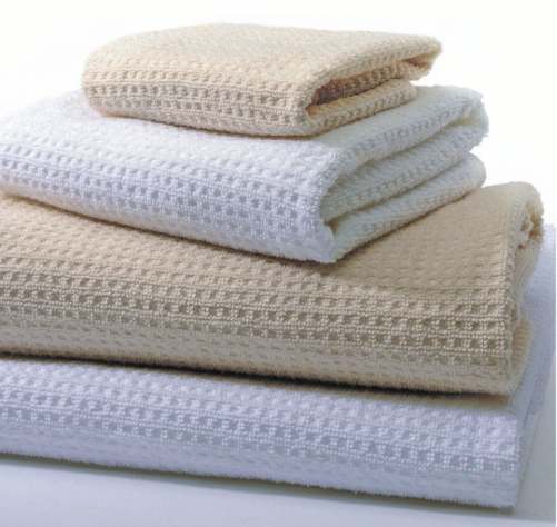
We came across a fancy sounding towel called nido d’ape in the book “Flanagan’s Smart Home“–author Barbara Flanagan’s wonderful book that lists 98 must-have housewares for the pared-down life. Nido d’ape simply means “bee’s nest” in Italian. Americans call them waffle towels. The shallow cavities in the fabric effectively increase surface area, wicking more water with minimal increase in bulk. They take up a fraction of the volume of their terry cloth brethren, dry much quicker and absorb amply.

We’ve been using waffle towels in the LifeEdited apartment and have been impressed by their performance. Author Barbara Flanagan warns the towel’s feel is “bracing,” and they lack the “security blanket-like fluffiness” of terry cloth. That has been our experience as well. The towels grip your skin. Her solution: “Grow up. Persist. There will be lighter loads of laundry filling fewer baskets straining fewer appliances.”

We’ve been using the Aquis microfiber towel, thinking that the synthetic material would dry quicker. It does, but we also noticed that if they are not dried off quick, they get a funky moldy smell.

This author uses a cotton variety from Gilden Tree. While they don’t have the squeegee feel of the Aquis, the towels do dry both your body and themselves quickly. The cotton is not nearly as odor retentive as the microfiber.

We also experimented with a smallish 19 x 39″ size, thinking the ability to wrap it around the waist would be sufficient. It wasn’t. It barely fit around the waist and was barely deep enough for men, much less women. The larger 29 x 55″ size proved much better and the bulk when stored is about that of a terry cloth hand towel.

Flanagan blames the excesses of the 80’s for the “hotel towel”–essentially a piece of terry cloth that could house a Bedouin village–becoming the household norm. The only problem is that if you lack daily maid service and a store-room, these towels make no sense. Waffle-weave towels do, saving space and energy while doing what they’re supposed to do: dry.

[Note: this post was originally published on August 9, 2012. After a couple years of use, we made a couple refreshes to the article.]

Good Things Come in Small Boxes

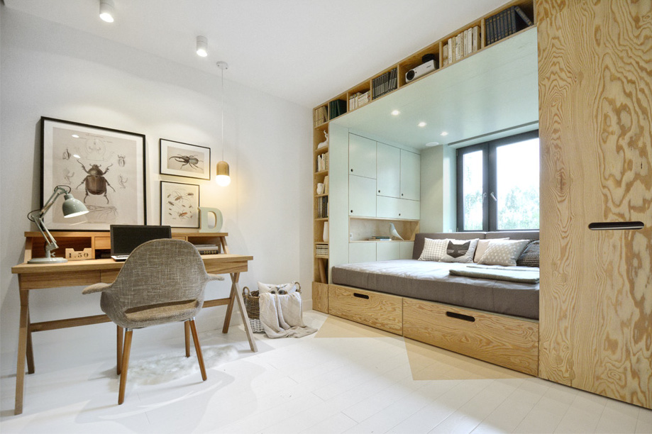
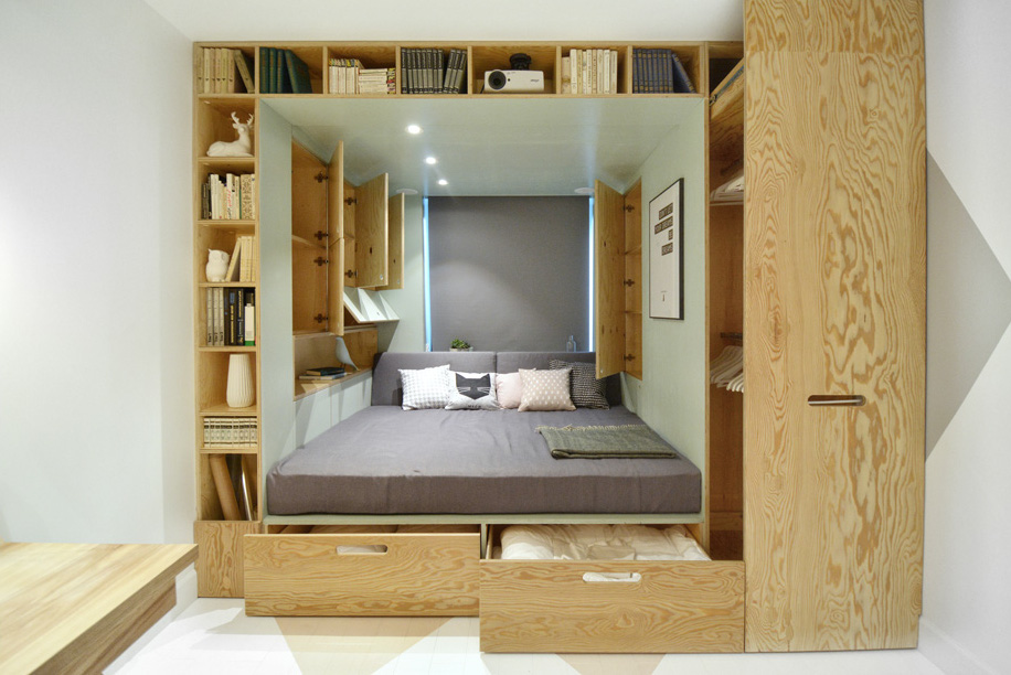
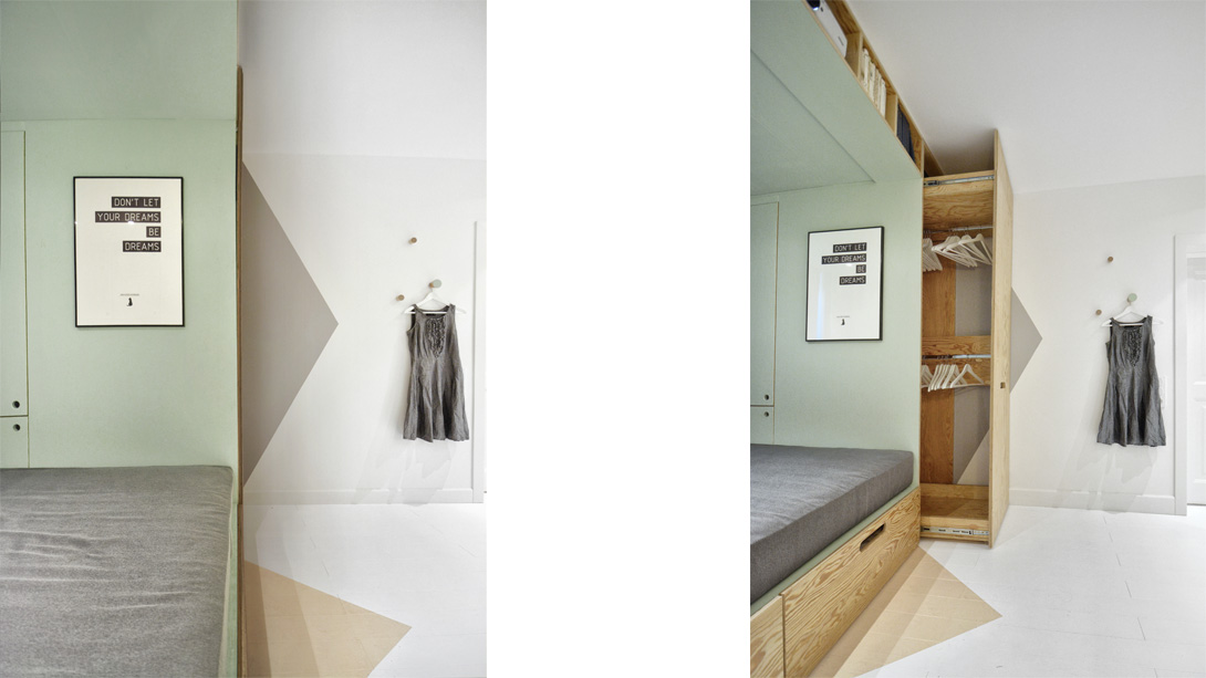
With crappy design, 200 sq ft can feel like a confining trap with little functional value. With great design, like this little room by Moscow’s INT2 Architecture, 200 sq ft can feel open and perform like a space much larger than its tiny footprint would suggest.

In order to maximize space, INT2 built a plywood box that occupies half the room. The box includes ample storage for clothes, books and more. In its center is a bed that doubles as a lounge area. The box is cut out in the center, allowing access to the window, which, combined with the apartment’s light color palette, makes the space feel open and airy–not an easy feat for such a small space.

There is a projector mounted in the front of the box which projects onto a sliding panel mounted on the opposite wall. Depending on where the panel is placed, it reveals either a chalkboard or mirror–the former providing temporary decoration, the latter making the space feel larger. The final touch is a tasteful small desk and chair.

We can’t ascertain what the space is used for, but it seems perfect for a dorm room or shared living situation–spaces that are rarely given such design flare. We imagine the construction of the box was not terribly expensive relative to the aesthetic and functional value it brings the room, and is something that could be made fairly easily by a competent carpenter.

via Trendir

Flat-Pack Furniture Fuses Form and Function

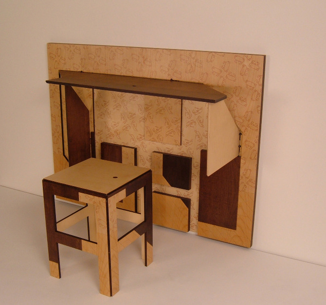
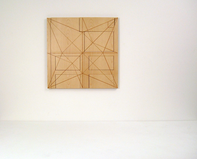
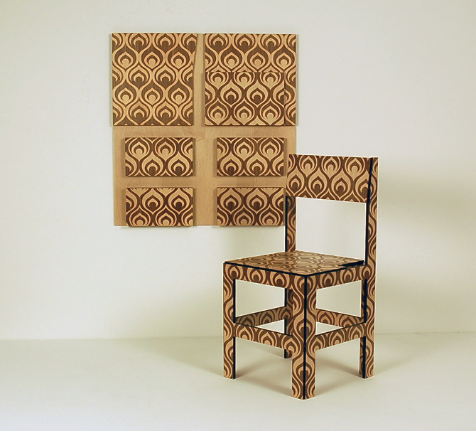
Artist and fabricator Christy Oates is a master at blurring the lines between decoration and furniture. Her origami-inspired pieces have the detail and beauty of traditional wood-working, while her manufacturing processes–which include computer-aided design (CAD) and laser-cut, CNC machines–are decidedly new school. Check above video to see how they are made.

She makes tables, desks, chairs and even lamps that hang flush with the wall. She designed them for small spaces, knowing that even pieces of art can do double duty. See more of her work and get more info at her website: www.christyoates.com

IKEA Bets Big with Small

Consider this: IKEA is the world’s single largest consumer of lumber. In 2012, they sold $37B of furniture across their 349 stores in 43 countries. Love em or hate em, odds are, at some point in your life, your butt has sat on a chair whose name has an umlaut in it. So when this furniture behemoth throws its might into small space living, it’s a big deal.

IKEA has already given considerable energy to small space living. Many of their showrooms feature mockups of small apartments to show what’s possible with their furniture. However, it can sometimes seem like they are shoehorning big furniture in small spaces. Now, they’re going further, designing their PS 2014 collection specifically for compact digs.

The collection is called “On the Move,” so named for the urban, mobile customer it’s designed for–customers who might lack a big space and budget, and for whom the ability to port his or her furniture from one apartment to the next is a big plus. The collection’s promotional video (above) shows young folks carting their furniture around by foot, pedal and public transport.

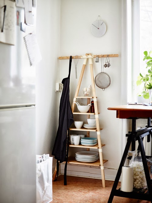
There are a number of pieces such as the leaning kitchen rack and wire wardrobe that are both lightweight and ideal for spaces with minimal or no builtin closets (a common scenario for many apartment dwellers).

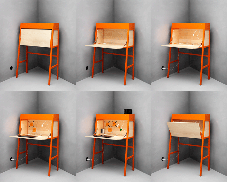
ikea-desk

Beyond being lighter to move from place to place, the collection’s skeletal designs seem to rely less on the clunky, warping, delaminating particle board that is the hallmark of IKEA furniture. In its place is more metal and solid wood, which we imagine will hold up a lot better over time–a good thing even if the typical buyer of this stuff might not be thinking longterm.

NEW_TRAY_TABLEIt’s easy to dislike the idea of a big multinational corporation homogenizing our global interiors. But when that same corporation brings good design and quality to large populations at reasonable prices, it deserves to be taken seriously. We think the PS 2014 collection is pretty cool and will work for the way a lot of people live nowadays. It’s set to release in stores April 1.

Let us know what you think.

Dealing with 3 Common Roadblocks to Downsizing

Mark Twain wrote, “I am an old man and have known a great many troubles, but most of them never happened.” In other words, it’s often the trouble in our minds that cause us the most anguish. This conceit can be very true for those of us looking to downsize. We create so many stories about all the trouble that could happen when we downsize, that we fail to realize these troubles are often stories or easily surmounted challenges. We fail to realize that many people through the ages have lived happily with far less than we have, in spaces far smaller than we live in. And not only might a smaller home with less stuff not be awful, we might even like it.

That said, there are a number of oft-heard arguments that can present barriers to living a life with less space and stuff. We thought we’d present a few and ways you might deal with them.

Problem: “How many square feet is that?” Sometimes the hardest part of downsizing is talking about it. Most people can’t comprehend that living in a smaller space with less stuff could possibly be a choice. It’s something you do because you’re broke and have no better place to live.

Things become even more difficult when other people’s questioning becomes our own. We start thinking, “Are they right? Am I crazy? I need more space! I can’t live without my ______. What am I thinking?”

Solution: Don’t bring it up as an issue to people who might not understand. If you go on Tiny House chat board, people will admonish you for living in a space bigger than 250 sq ft. Most Europeans live in a fraction of the space Americans do. Not everyone has the same orientation to space, and to many (read: Americans) a small apartment or home doesn’t mean intentional downsizing, it means downgrading. Don’t get into it. Don’t mention square footage. Don’t get defensive if you do. Talk to friends who understand. Read this blog more. We support you. You’re making a choice that’s right for you!

Problem: “I need my privacy.” This is obviously geared toward people who live with their partners or families. They worry that a small space won’t afford the kind of healthy distance needed to maintain a peaceable kingdom.

Solution: Some capacity to absent yourself in your home in a non-confrontational way–i.e. not storming out of the house–is probably a good idea, but this can take shape in the form of a bedroom, separate kitchen or room divider. This room need not be big.

The problem is people have taken privacy too far. It has become expected that every family member have their own retreat where (typically) they bury their heads in their TV, computer or tablet, free from the need to relate to one another.

Most homes around the world lack room to spread out. In England, for example, the average new home size is around 950 sq ft (compared to the 2500 in the US). Though we can’t prove it, living close to the people in our lives is more beneficial to relating to others than living with a “healthy distance.” The former have to communicate and deal with one another–a dying art in the era of the McMansion.

Problem: “There’s no room for that.” We look at a small space and contrast it to our current, bigger one. We see the impossibility of fitting our existing stuff into the new space. This can apply to big stuff like furniture or small stuff like sentimental objects and clothes. It particularly applies to our kids, who seem to carry a monumental amount of stuff.

Solution: There is room for that, particularly if there is less of that. The fact is editing one’s life requires a certain amount of removal. It need not be a wholesale removal–if there are certain objects you can’t bear to get rid of, don’t get rid of them. But at a certain point, we might need to get rid of a salad spinner or the trade in our sectional couch for a love seat or do with a few less pairs of shoes in our closets.

It makes far more sense to adapt the amount of stuff to our lives than making our lives adapt to our stuff. For example, if a small home in the city is where we want to live, we might have to get rid of a number of things to make that work.

While kids do typically carry a certain amount of baggage, it’s nowhere near as much as Kids R’ Us might have us believe. A curated, culled and contained toy selection is achievable and takes a lot less space than you think.

Also it’s important to focus on the benefits of editing our lives. When we focus on the freedom of having less to maintain, buy, clean and pay for, the penalty of letting our salad greens dry on a dishcloth seem a lot easier to deal with.

Have you downsized recently? Did you face challenges from within or without? How did you deal with them? Let us know in our comments section.

Miniature House image via Shutterstock

Furniture Fit for an 81 Square Ft Home

One of the biggest mistakes you can make decorating a small space is shoehorning furniture designed for more conventional spaces into your compact space. If the space you’re working with is 81 sq ft, not only is there no space for conventional furniture or much stuff, there is no room for error–every square centimeter must be thought out and purposeful. This was the challenge Vancouver-based designer D Calen Knauf faced when he was commissioned to design furniture for some short-stay, single occupant dwellings.

Beyond the space constraint, Knauf had to design the furniture with sustainable materials and it had to cost less than $500CAD. His Nine by Nine collection is his response to these challenges.

Every aspect of the furniture was designed to reduce visual clutter. Knauf explains some of his methodology:

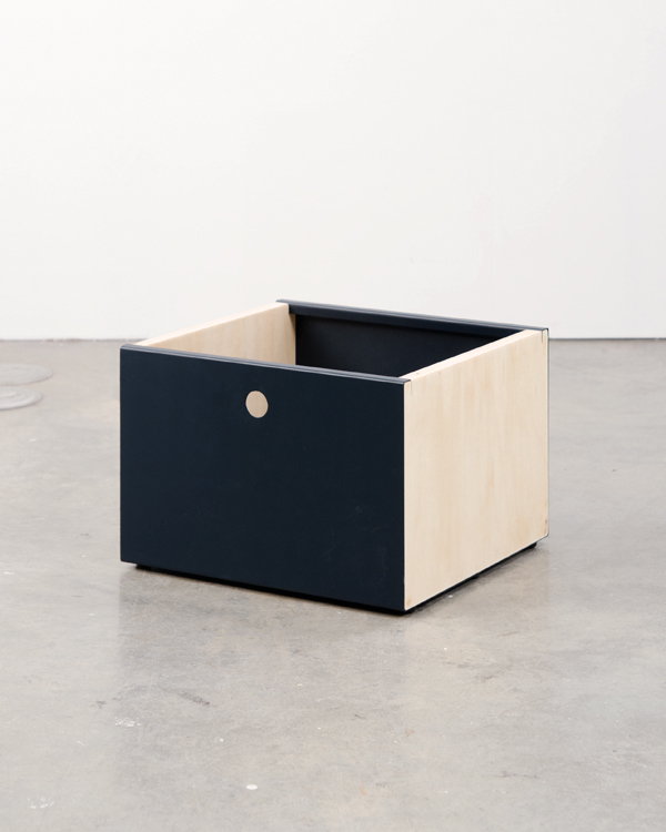
We used wireframe-style construction to open up the room wherever possible instead of closed in panels. When flat panels were needed, we used bent steel for its low visual profile. By orienting the hanger rack so that the clothes face the user instead of the conventional method, the wardrobe unit can be pared down to 12 inches deep, taking up less of a footprint into the room. One of the four beams has been removed so hanging clothes are more easily accessed. Even reducing visual clutter helps make a room seem bigger, so we included a cable well behind the desk so the user can keep important things on the desk and power cords out of sight.

To keep with the sustainable theme, wood is locally sourced fir ply. In order to keep prices in check, the number of items were kept to the bare minimum and designed to be multifunctional, like the wardrobe drawers that can also be used as standalone storage units.

Knauf’s design definitely supposes a resident with virtually no possessions–and possessions he or she is willing to display. But we like the reasoning behind his design and its clean, modern and utilitarian aesthetic. If we had to live in 81 sq ft, this might be how we decorate it.

Image credit: D Calen Knauf