
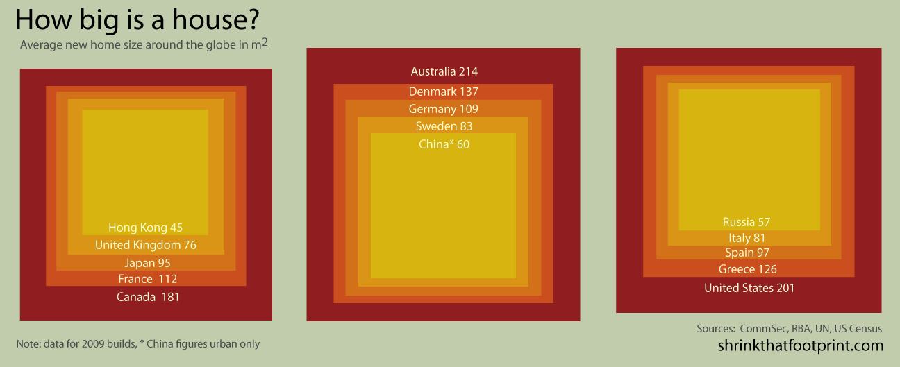
These infographics from Shrink That Footprint show the average new house sizes across the world in 2009. Despite the American penchant to do everything a little bit bigger, it’s the Australians who claim the prize for world’s largest homes.
Without getting too pseudo-scholarly about the situation, the three countries with the biggest homes (Australia, US and Canada) began as British colonies a few hundred years ago. Unlike their motherland, all were fairly unbound geographically (no pesky oceans every 20 miles). A good portion their infrastructures were created after the widespread availability of cars. All of these factors surely contributed to the overgrown housing statistics we see here.

The other infographic concerns per capita space use, which divides housing size by household number (most developed nations average around 2.5 people per household). These figures are predictably correlated with overall housing size. Again, Australia wins the dubious prize for most space per person.

We fished around Shrink That Footprint and found another infographic showing per capita residential electricity use. Interestingly, Australia is a lowly fourth place in this heat (behind France, whose homes are 90% smaller!). Canada makes a from-the-behind dash to the front; with its harsher-than-most winters and big homes, it is often crowned the world’s energy gulping king (there is no explanation as to why Australia’s numbers wouldn’t be commensurately higher due to inordinate use of AC, particularly for its large homes).
What’s not shown in the graphics are trends. For example, China, whose energy consumption is a fraction of countries like the US and Canada, has seen a 600% increase in electricity over the last 20 years. New homes in the US are almost as big as ever. And household sizes are shrinking in Europe (albeit by a small amount), which means per capita housing size is increasing there.
The good news is…we’re not sure what the good news is. Housing sizes are bigger than ever and energy consumption continues to increase across the globe (except for the countries in most dire need). One thing to extract is that housing size is not correlated with quality of life; for example, Denmark and Sweden, who both enjoy high standards of living have smaller homes than the Big Three. But then again, their infrastructures–smaller cities with high quality public transport–support those smaller homes (not the case with the Big Three).
What do you think? What can you deduce from these figures? Is there a silver lining or will the world continue to consume until it bursts? Let us know your thoughts in our comments section.