LifeEdited Maui: A Quick Update

As we near the end of summer we’d like to provide you all with the first glimpses of our newest project, LifeEdited Maui. LifeEdited’s CEO, Graham Hill is currently on location in Hawaii overseeing the build. For the month of September we’ll be showing you the process of how we are designing our eco compound. As October rolls around, our construction updates will be in real time leading up to the big unveiling.

Site preparation

The goal of LifeEdited Maui is to build an off-grid, low impact, luxurious, space-efficient four bedroom house in 1000 sq ft. LifeEdited Maui is about finding the most innovative answers about how the future will live. We are presenting a version of the future that is sustainable, resilient and, frankly, awesome.

We believe in self sufficiency and tasty food, so we have already planted 30 different kinds of edible plants including bananas, mangos, and papayas. Our long term vision includes this fruit orchard, raised garden beds, some purely endemic Hawaii acreage as well as creating nurturing habitat for birds, bees and other local fauna. Walking paths, benches, hammocks and agriculture structures around the property will encourage engagement and connection with nature.

As the building process approaches completion, the applications of transforming design as exemplified from our previous projects will also take shape in LifeEdited Maui. Beds that fold into walls, tables that expand, rooms that do double and triple duty—serving to maximize available area for this live work space.

One of the guiding principles behind LifeEdited Maui is to have as light of a footprint on the environment as possible while still building homes that don’t make compromises in form or function.

Wood frame coming together

Stay tuned to our social media and newsletter for more updates!

The Unbearable Lightness of Tiny Living

Each week we are profiling real people who are editing their lives for more freedom and happiness. This week we hear from Jan, who lives in 98 sq ft tiny house. He shares his experience about the freedom of tiny, lightweight living as well as the difficulties of meshing different attitudes about stuff and space in relationships.

Tell us about yourself

My name is Jan. I am 45 and work as a photographer and videographer. I am separated with a 3-year-old boy.

My parents, both children in Germany during the WWII, instilled a non-consumptive, credit free life-style. They modeled buying quality over quantity and only paying cash for what you can afford.

Later, I backpacked for several years, and all through my twenties and early thirties never paid more than $100 rent per month. I learned to build and built my own shelter, or did work-trade for rent. For years I kept my possessions down to what would fit in the back of a small pick-up truck.

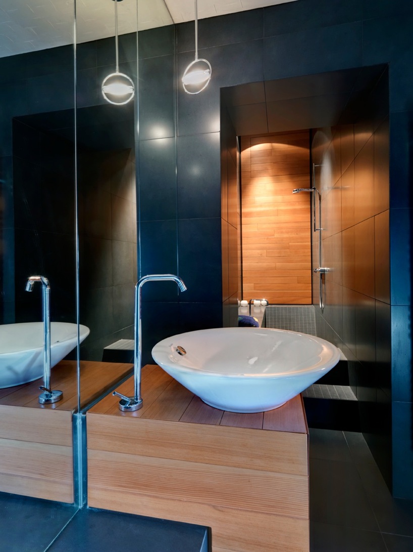
In my late thirties I fell in love with a beautiful woman who lived an unedited life. Stuff gave her a sense of security. Clutter was her art form. For six years and through the birth of our son, we tried to blend our lives, but could not. Accepting neither of us would change, I built a 6×9 foot shack in the backyard and moved out. We get on much better now.

What makes your life an ‘edited’ one?

I’ve always been self-employed, so I’m very aware how much effort it takes to earn each dollar. Not believing in credit, each purchase I make is a conscious decision. How much of my life does it take to afford this thing? I’m also aware how much effort is required to own stuff. Where to store it? How to store it? How to care for it? Unnecessary stuff and clutter simply makes my anxious. But that’s not to say I’m non-materialistic. I would argue that I’m hyper-materialistic. I love the look, feel and function of something well made that fits my life perfectly. A pair of shoes I wear every day. Two sharp kitchen knives. A bicycle. A camera. All these things, carefully chosen gives me great pleasure to buy and use daily.

How long have you been living this way, and do see yourself continuing to live this way?

I have always had a minimalist bent, but lately have been refining it with far more awareness. It merges many divergent interests, from macro and micro-economics, environmentalism, self-sufficiency, spirituality, design, art, parenting, and how we will make it as a species in a shrinking world. Presently, how I live is a personal choice. In the future that choice may be forced upon us.

What are the biggest advantages of living this way?

A profound sense of lightness in the world. Every time I discover a way to live more essentially, I feel a surge of freedom. When I refine an elegant solution to a vexing problem, I gain great pleasure each time I engage with that solution. Something as basic as placing a hook into a wall so I can hang my bag and not trip over it on the floor. Or building a composting toilet for a few dollars and taking personal responsibility for my own waste. Or lying in bed at night in a loft that fits me just so. Watching the moon rise and stars turn because I deliberately placed the windows in these precise locations. Or each month doing my bookkeeping and seeing my savings increase to a point where I could live comfortably without working for a few years. And not because I earn a lot of money, but because I have learned how to spend wisely.

What are the biggest challenges?

Trying to meld a minimalist lifestyle with someone who does not share the same interest. It is an exercise in futility and frustration. I had to learn to accept that I can neither change someone else’s life nor repress my own nature.

For families, how has this lifestyle affected the other members of your family?

Thankfully I have a young son who stops me from getting too anal. He helped build the shack and feels it is his as much as mine. He comes and goes as he pleases with his toys, muddy shoes and dirty fingers. I let him climb up ladders, on counters, light stoves, play with tools and knives, and in doing he learns respect, consequence and body awareness. He teaches me to let go and lighten up. If he breaks something we fix it together. If he gets something dirty, we clean together. After all, it’s just stuff. What’s essential is the respect between us.

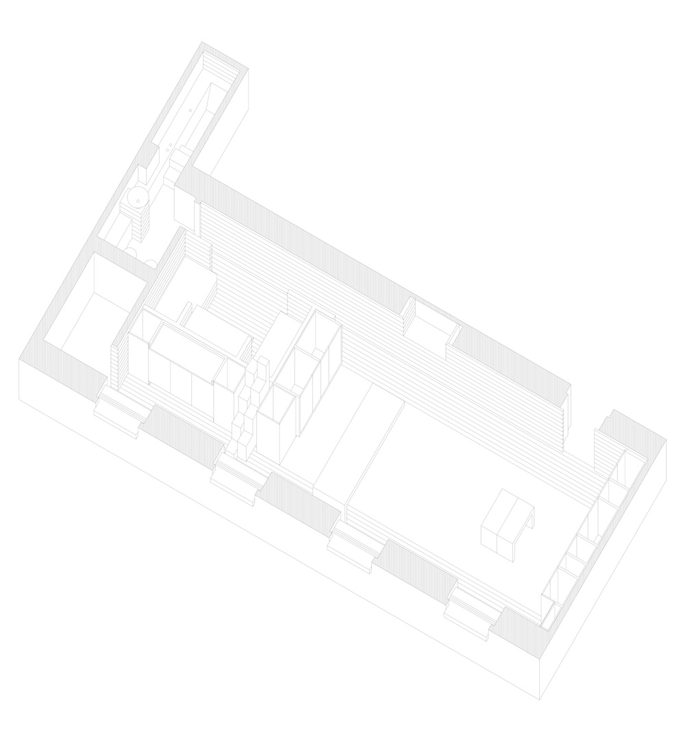
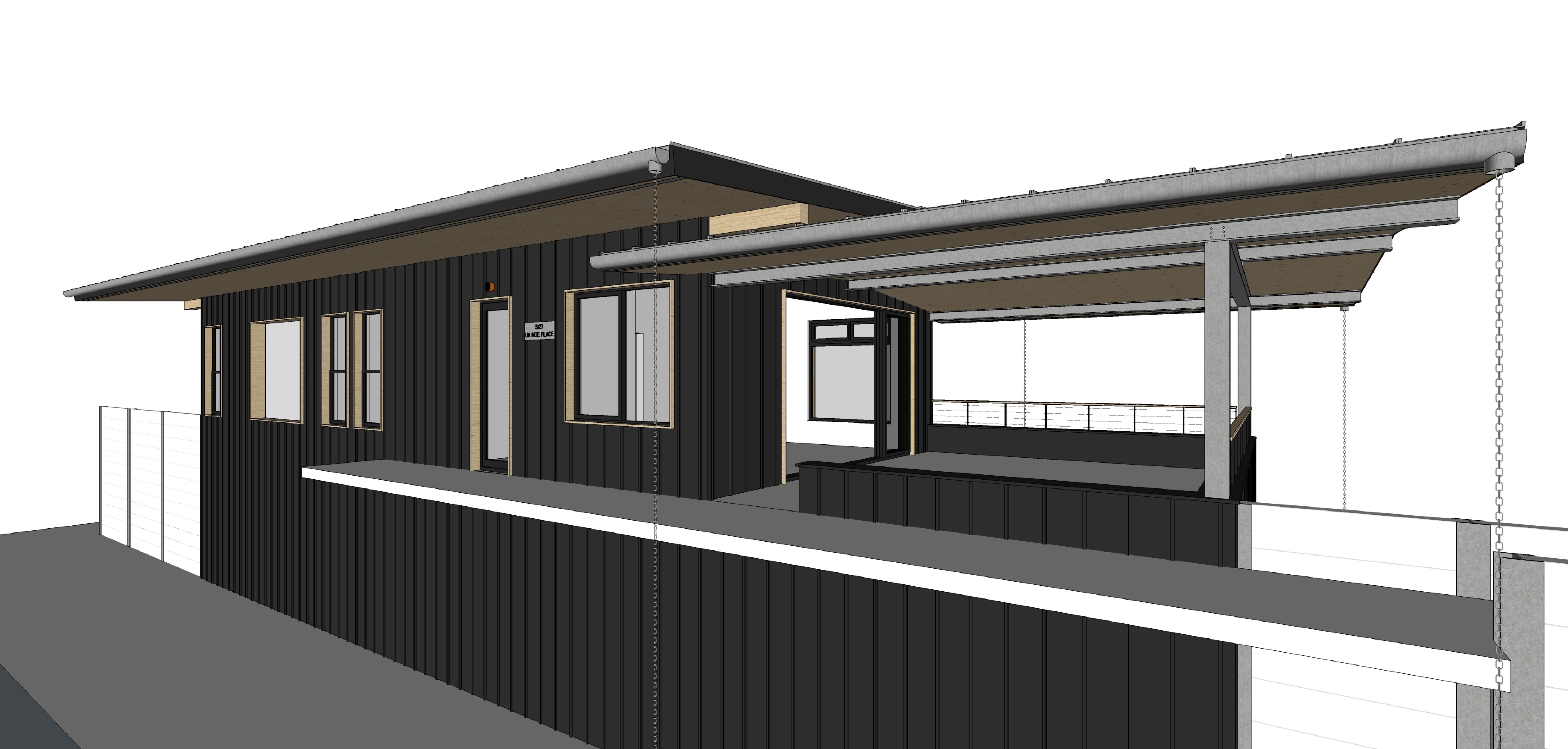
In terms of partnerships, I think a minimalist lifestyle only works both partners already live this way. I also strongly believe in a shack of ones own. My home only cost me $5000 and three months of work. I’d rather help build a partner their own home than try to blend two incompatible lifestyles together.

What is the number one suggestion you’d give to someone looking edit their lives?

Read the book “Your Money or Your Life” by Vicki Robins.

What item(s) have made your lifestyle easier?

A good bicycle, good tools, a few comfortable clothes that fit well and can be worn in different settings.

Do you have any design or architectural suggestions derived from your lifestyle?

Consider curved rafters. That simple architectural detail made all the difference in turning my loft from a cramped triangle into a spacious cocoon.

This post was originally published November 28, 2012. 

The Hills are Alive with the Sound of Innovation

Started in 2008, Summit Series has established itself as one of the world’s premier events focusing on entrepreneurship, addressing global issues and support artistic achievement. Past speakers include Richard Branson, Bill Clinton and Tony Hsieh. Summit Series is known for its amazing settings; past series have been held in such places as a ship cruising the Bahamas and Squaw Valley.

powdermountain

In 2013, Summit, the company who runs the series, partnered with venture capitalist Greg Mauro to purchase Power Mountain, America’s largest ski area, located in Eden, Utah. The intention was to create a permanent home built around the ethos that their community and organization had come to embody and promote. In an effort to create this home, called Summit Powder Mountain, they are developing a village along with a sustainable residential community–think of a smaller version of Telluride. Mauro, now Chairman of Summit Powder Mountain, commented, “We wanted to stop the ‘McMansionization’ of mountain towns that has reached absurd levels–48,000 sq ft houses in some areas–and focus on smaller homes and cabins that preserve the national park feel that exists here. So we limited the number and size of our largest mountain homes to 500 units with a maximum size of 4500 sq ft above ground respectively, and are complementing these with small cabins from 360 to 1500 sq ft.” Working in conjunction with Summit’s architects, LifeEdited was called upon to conceive some of these cabin residences.

INT04INT02

While the terms “compact” and “ski lodge” tend to be mutually exclusive, that’s exactly what we’ve done with the Overlook 360 design. The unit is a split level studio-style dwelling with a main room containing the kitchen, dining area and lounge. With the help of a hiding wall bed/sofa, the living room turns into the master bedroom at night. Above the main room is a loft area, creating an alternative place to hang out. Overlook 360 uses large windows and simple materials to keep the interior bright and open. Built-in storage, the transforming bed and minimal furniture make the space feel larger than its small footprint might suggest. There is a large deck and green roof to exploit and blend into the area’s amazing natural beauty.  

EXT02

One of Powder Mountain’s design objectives is to make its architecture “subservient to the natural landscape,” and one of the easiest ways of doing that is to make the architecture smaller–less home equals more natural habitat. Additionally, Overlook 360 will neither be connected by roads nor have parking spots connected to the cabins. Parking will be in nearby “parking barns” and everything will be accessed via a network of paths. By doing this, the homes will enhance their natural settings and possess a retreat-like quality to the district they inhabit.

Overlook 360, as well as multiple neighborhoods and districts will be developed in the next couple years. For more information, visit Summit Powder Mountain’s website.

Image © LifeEdited 2015

Data Driven Architecture

One of this site’s most popular posts to date is “Residential Behavioral Architecture 101.” The reason, I believe, is how it shows the gulf between how our homes are used and how they are designed, not from a speculative or conjectural perspective, but from a data and fact-driven one. In the post is a map showing how one particular family moves through their house and how they use only a fraction of the available floor area (a map that the researchers of the study that made it believe is representative of many homes). The map helps remove the political and dogmatic notes that often enter the downsizing conversation and make it wholly practical. We should consider downsizing our very large homes because we usually don’t use most of our available space.

I recently did a guest post for the website Medium, entitled “Design Driven Architecture.” In it, I bring up the map (pulled from the illuminating “Life At Home in the 21st Century”), once again making the argument that much of the floor area of large homes goes unused. But I go a few steps further in showing how home design is often out of step with data–a gap that undermines personal and global interests. I point to a growing body of research that shows how our big homes are:

  • Housing stuff we rarely use.
  • Pushing us further from city centers, making our commutes increasingly long. And numerous studies show how we hate commuting.
  • Completely out of step with demographic trends toward smaller households for all ages and particularly for older adults.
  • Helping push our already precarious environmental situation further toward the brink.

After all that, we present what we see as ways forward with a bunch of pretty pictures. Read the full post here and let us know what you think.

Suburban neighborhood image via Shutterstock

Mansions for All!

Inspired by yesterday’s post about residential hotels, we thought we’d look at how other nations handle clean, safe and affordable housing for single folks. In Japan, there is something called called the “wan rūmu manshon” or “one room mansion” (get it?). It’s a very small studio (~100 sq ft) with a bed, bathroom and kitchenette. They’re not fancy or architecturally that interesting. We found some with nifty glass-wall bathrooms (another living room?), but for the most part, they’re small, simple rooms to crash in. They’re designed for singles who don’t need, want or can’t afford anything more.

wan-rumu-manshon

Japan has 870 people per square mile, making it the 39th densest nation in the world (US has 84 people per square mile and is the 180th densest). Because of these geographic circumstances, Japan doesn’t have the space for one-size-fits-all housing. Single people use the space they need, which is less than couples. Couples use the space they need, which is less than a family, and so on.

The US’s surplus of land has led to many of us to occupy spaces well beyond our needs: singles live in two and three bedroom homes, empty-nesters have 4K sq ft homes and so on. The result is more money spent, more places to store stuff, more sprawl, more energy expended, more surfaces to mop, dust and upkeep. Perhaps it’s time we start using what we need, rather than what’s available. Perhaps it’s time we start building tiny mansions for everyone.

A version of this post first appeared on this site on April 24, 2012

Pop Up Apartment Defies Expectations, Physics

File this Dutch-university-student-designed Pop.up Apartment under the no-freaking-way category. Relying on polypropylene sheets that slide along motorized guides in the floor, the 50 sq m (538 sq ft) apartment can be configured in dozens of ways, giving it the functionality of a space twice its size. The sheets not only act as slide-out walls, but many of them bend to create much of the space’s furniture.

pop.up-apartment-floorplan

The project is the product of the Hyperbody design team at TU Delft University. The question the team sought to answer was how to fit more function into the modern city’s limited real estate. Like MIT’s CityHome, their answer is profoundly technical, replete with motors, app-controllability and lots of CNC cut panels. The team likens the space to a Swiss army knife, where only the desired tool is folded out, while the unused ones remain hidden.

I’m glad I watched the project’s four minute Youtube video. As I watched the computer modeling of the project, I thought “there’s no way this can be done in real life.” I was quite wrong. They made a full-scale, functional mockup in an empty office space.

pop.up-apartment-dining

For a simpleton like me, it’s important not to pass judgment too quick on the Pop.up Apartment. It seems too complicated by half. There are too many motors, too many things to go wrong. The curlycue  aesthetics aren’t my thing. I wonder how the plastic sheets’ resiliency will fare over time…and so on.

This is a concept and a bold one at that. And like all concepts, it’s going to be filled with many ideas that will end up on the edit-room floor. But some ideas might be useful, informing and improving on more conventional designs.

See more videos, drawings and images on the project’s website.

Via Fast Company

Nakagin Capsule Tower: The Future of Compact Living, circa 1972

Don’t let its weathered facade fool you, the Nakagin Capsule Tower was one of the most innovative architectural designs of its day. Designed by architect Kisho Kurokawa, the Tokyo tower was completed in 1972 and the crown jewel of the Japanese “Metabolism” school, which, according to Wikipedia held a vision “for cities of the future inhabited by a mass society [that was] characterized by large scale, flexible, and expandable structures that evoked the processes of organic growth.”

nakagin-interior

While many architectural concepts like this never see the light of day, the Tower was (and continues to be) the real deal. Each of the 140, 90 sq ft living capsules was detachable from two main concrete towers; you could also join smaller units to make bigger ones. It was expandable, upgradeable and repairable. In fact, when the 40 year old building was threatened with demolition a few years ago (a threat that unfortunately remains), Kurokawa proposed to replace the capsules rather than tear it down. The Towers still stand today; reportedly, half of the capsules are being used as offices, while others are being used as part-time and cheap housing. One unit is even available to rent on Airbnb!

nakagin-stereo

Though its execution is a bit dated (the interiors look straight out of “2001: A Space Odyssey”), the Nakagin Tower proves that architecture needn’t be bound to the orthodoxy of its day. As Nicolai Ouroussoff wrote in the NY Times, the Tower’s “existence…stands as a powerful reminder of paths not taken, of the possibility of worlds shaped by different sets of values.”

Of course some paths are not taken for good reason. Nakagin was plagued with problems such as problematic plumbing, ventilation and less-than-optimal layouts for the capsules considering their small size.

Despite its faults, the capsule tower stands as a pioneering design for micro, prefab living. As our housing needs shift, as we recognize new values and design a new world around them, we can look and learn from intrepid pioneers like Kurokawa, who saw the future as more than a continuation of the past, but as a creation of worlds that might be…and then we can add functional plumbing and windows and call it a day.

[This post was originally published on March 22, 2012. Some updates and images have been added.]

Residential Behavioral Architecture 101

The above image was taken from an article in a Wall Street Journal article about the book “Life at Home in the 21st Century.” The UCLA group responsible for the book followed 32 middle class Los Angeles families around their homes, tracking their every move to see how people actually live nowadays. This image shows “the location of each parent and child on the first floor of the house of ‘Family 11’ every 10 minutes over two weekday afternoons and evenings.” In other words, primetime for their waking hours at home.

The activity on this floor, which measures around roughly 1000 sq ft, is concentrated almost exclusively in three rooms: The dining, kitchen and family rooms; the latter room’s activity focused around the TV and computer. We estimate that around 400 or so square feet of those 1000 are actually used with any regularity.

Family 11’s house is very typical in size, if a bit smaller than the average new home, which was 2,662 in 2013. For comparison’s sake, in 1950 that same number was 983 sq ft and there were, on average, about one extra occupants in each of those smaller homes as well.

While we don’t want to assert that there exists a correct house size for everyone, if this case study is indicative of how many/most American households use there homes, it begs a couple questions: Why are American homes so big? And what would homes look like if designed around how most people behave? It wouldn’t be hard to imagine that this Family 11 could easily live in half the space they currently occupy.

An article in the NY Times from a couple years ago called “The Big Shrink” illustrates how our homes might look if based on behavior, not convention. The Kelly’s, a family with two adolescent children who were profiled in the story, traded in their 3200 for a 1200 sq ft home (Pictured above. Built in 1954 incidentally). Like Family 11’s home, the formal living and dining rooms were barely used, less one family member, as Greg Kelly explains: “We had a dining room and a formal living room—that was where the dog lay on the couch, that was his room.”

We’ve often argued that micro-apartments make complete sense based on the way the majority of single people live. Our question to readers is, “How would you design a home if based on your behavior, not architectural convention…for singles, couples, families, etc.?” Let us know what you think in our comments section.

[Note: this post was originally published on December 14, 2012. A few updates have been made.]

Kelly home image credit: Ryann Ford for The New York Times

Five People, Nine Cubes, Lots of Wood

By LifeEdited standards, 872 sq ft (81 sq m) isn’t small, but when it’s housing a family of five, it’s pretty impressive. That was the space Brachard de Tourdonnet Architects were tasked with making work for one French family. Besides normal home functionality, the clients wanted the home to be like “life in a caravan in which everything is functional and integrated,” according to the architect’s website. What they devised was a space portioned into nine cubes, each measuring 97 sq ft, a ton of built-in furniture and walls and doors that can be opened to create larger spaces or closed off for private ones as needs and family affection (or lack thereof) demand.

We’d guess the ceilings are about 12′ high–tall enough for two of the cubes to be divided vertically such that there are sleeping lofts for the kids. Narrow hallways and glass walls allow light to pass from the south-facing window bank to the back of the house where there are no windows.

The architects do not indicate what type of wood is used for the main structure, but there’s a lot of it. What we know about custom millwork like this makes us guess this place cost a fortune to build. That said, we don’t know the particular economics of the space. It may have been much cheaper to renovate then move to a larger apartment.

The coolest feature of the apartment is that it provides at least one door for every member of the family. In other words, if everyone is feeling antisocial and sick of one another (a not so rare occurrence in many families), everyone has a place they can call their own. For five people to do that in a space less than 900 sq ft is impressive indeed.

Via Living in Shoebox

Milanese Flat Shows There’s More than One Way to Chop a Box

Few shapes are easier to work with than the box. Halve it, quarter it, cut it into thirds. But because of these endless possibilities, it can be difficult to choose the best one. In thinking about how to best divide a 624 sq ft apartment in central Milan, architect Daniele Geltrudi looked to early 20th Century architect Adolf Loos for inspiration. Loos had created something called the “Raumplan,” a design that shirks traditional room divisions in favor of flowing, multilevel spaces. Loos said, “For me, there are only contiguous, continual spaces, rooms, anterooms, terraces, etc. Stories merge and spaces relate to each other.” Loos’s philosophy is evident in Geltrudi’s design, which creates a unique flow of spaces with various different levels and chambers.

The main space has 12 ft high ceilings, which Geltrudi uses to maximum effect. He installed a large wooden volume that contains the kitchen, a lofted bed and a small chamber underneath which can be used as a study or second bedroom. Because the volume takes up relatively little area (about 176 sq ft), Geltrudi was able to make the living area very spacious and even include a nine foot dining table.

Other features include built-in storage throughout, both built into the douglas fir-paneled walls as well as the wood structure; this ample storage sidesteps the need for most freestanding furniture. There is also a bathroom that creatively squeezes a tub into the long skinny space.

In some ways, the apartment reminds us of a very high end version of Adam Finkelman’s studio conversion we looked at last month. The size and shape of the space is remarkably similar. Both used vertical space to install two bedrooms. The budget…well, we don’t have Geltrudi’s numbers, but we suspect it was slightly north of the one month’s rent Finkelman forked over. I guess the similarities end there.