Luxury Micro-Apartments Come to DC, Transportation Included

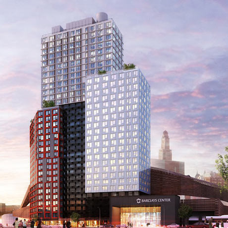
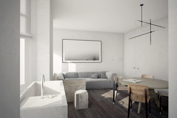
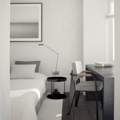
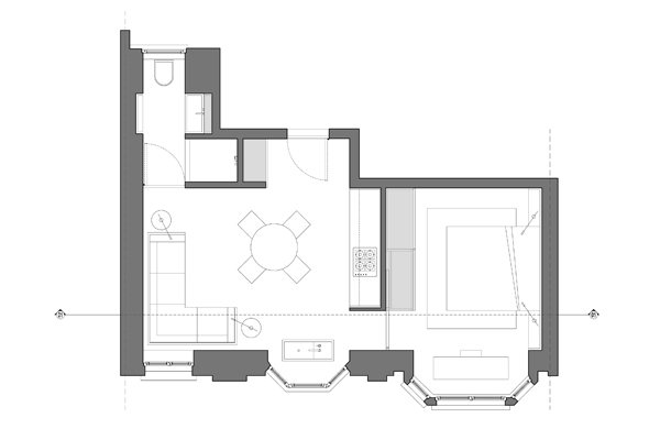
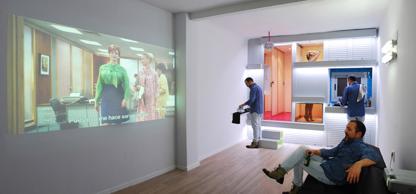
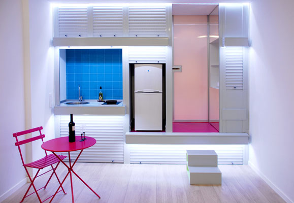
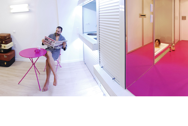
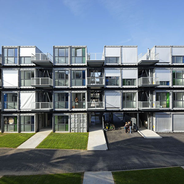
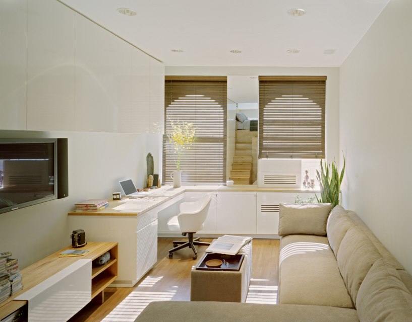
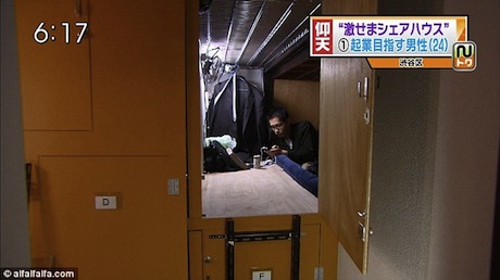
A new micro-apartment building will be going up on the 1400 block of Church St NW in Washington DC. It will have 37 units ranging from 265 to 490 sq ft, according to Brook Rose who, along with Gregg Busch is developing the project. Rose’s specialty is luxury development and he sees the Church St apartments as consistent with that. “We are going to try to make these luxury micro apartments,” Rose told us. The rental apartments will feature floor to ceiling windows and high end finishes. The smallest units, where there is an imperative to have all the furniture work perfectly with the space, will be semi or fully furnished, using transforming furniture by the company Inova. Rents will likely start around $2K.

church_back

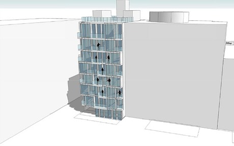
The building is a testament to the fact that Washington DC, a city that up until recently had been pretty ambivalent about micro-housing, is changing its tune, as evidenced by the likely micro-apartment development of the Patterson Mansion as well as this one.  But the city’s approval of the Church St building was far from a slam-dunk, having been held up by the Board of Zoning Adjustment (BZA) for a year because of issues around parking.

As we’ve seen here before, one of the primary sticking points for adding density to an area–something that micro-apartments tend to do–is parking. Most residential building requires a certain number parking spots per unit; these can be satisfied by on or off-street parking. Areas that have robust public transportation and walkable streets like San Francisco can often sidestep those requirements or provide minimal parking. But for most parts of the country, it can be a real barrier for development as it was for the Church St building.

Certain members of the BZA were not receptive to the idea of a building without parking, even though Rose was sure there were many “carless urban dwellers” who were “willing to trade space [and their cars] for lifestyle,” particularly in the building’s neighborhood which is along the 14th street corridor, a walkable area with tons of amenities. Rose calls the area “DC’s Soho.” One gesture Rose and Busch made to prove they were serious about creating a carless building was offer car and bike sharing memberships to residents for the duration of their leases (nb: residents would still pay for their use of the car).

The building eventually received the BZA’s narrow approval last month. The developers agreed to provide four parking spaces: two for residents to use for move in/move out and for guests and the other two will be for dedicated for car sharing cars.

But the city made a stipulation that residents could not apply for parkings permit that would allow them to park legally on neighborhood streets. This prohibition will be written into the leases and the developers will periodically check with the DMV to see if any tenants are violating the agreement. In other words, if you live here you cannot have a car.

Of course residents can elect to park in a private garage, but the arrangement seems like a prescient one. For most of the last 60 years, architecture has been bound to parking. Perhaps the Church St development augers a future where architecture and urban planning are designed as much around people as they are cars.

Good Things Come in Small Boxes

With crappy design, 200 sq ft can feel like a confining trap with little functional value. With great design, like this little room by Moscow’s INT2 Architecture, 200 sq ft can feel open and perform like a space much larger than its tiny footprint would suggest.

In order to maximize space, INT2 built a plywood box that occupies half the room. The box includes ample storage for clothes, books and more. In its center is a bed that doubles as a lounge area. The box is cut out in the center, allowing access to the window, which, combined with the apartment’s light color palette, makes the space feel open and airy–not an easy feat for such a small space.

There is a projector mounted in the front of the box which projects onto a sliding panel mounted on the opposite wall. Depending on where the panel is placed, it reveals either a chalkboard or mirror–the former providing temporary decoration, the latter making the space feel larger. The final touch is a tasteful small desk and chair.

We can’t ascertain what the space is used for, but it seems perfect for a dorm room or shared living situation–spaces that are rarely given such design flare. We imagine the construction of the box was not terribly expensive relative to the aesthetic and functional value it brings the room, and is something that could be made fairly easily by a competent carpenter.

via Trendir

It’s Fun to Live at the Y:Cube

In the quest to provide much needed affordable housing to London, architecture firm Roger Stirk Harbour + Partners, in conjunction with YMCA London South West, has designed the Y:Cube. The simple 26 sq meter (279 sq ft) house is, according to the Y’s site, meant to provide “self-contained and affordable starter accommodation for young people unable to either gain a first step on the housing ladder or pay the high costs of private rent.”

y-cube-crane

A couple things make the Y:Cube notable. First is it’s cost: about $50K to produce, which according to Fast Company, is 40% cheaper than traditional construction. Much of this savings is attributable to the use of prefab construction, where systemized and controlled building keep labor costs low while simultaneously making build quality higher. The units are essentially dropped into place nearly ready to live in.

Next, the structure can be built to stand by itself or stacked on top of another Y:Cube (many prefab structures are one or the other), making it adaptable to several different planning scenarios. There are plans to construct a 36 Y:Cube development this year alone.

Lastly, the houses are made with something called Insulshell, a closed panel structural timber system, which creates a near-perfect thermal barrier. The Y’s site claims that Insulshell will essentially eliminate the need for heating altogether, thus reducing the operating expense of the houses.

The Y:Cube seems to make a lot of sense to us. Though it doesn’t eliminate the real force we suspect is driving housing costs skyward (i.e. property values), it would seem to hold the promise of cutting construction costs considerably, which helps.

Prefabrication just makes sense. It mitigates so many of the costly variables that plague outdoor and one-off construction. Perhaps the main question we have concerns the Y:Cube’s aesthetic endurance. Will the Y:Cube look as timeless as the shack down the road 100 years from now?

dezeen_B2-at-Atlantic-Yards2This author lives in a part of Brooklyn where many of the streets are lined with classically styled housing, much of which is 100 + years old. The buildings’ brick and stone facades reek of craftsmanship and an aesthetic for the ages, not just the times (and people pay up the nose for them).

Travel a mile down Flatbush Avenue and B2–what will be the world’s tallest prefabricated building–is rising up like a growth on the Barclay Center’s backside. There will be 350 units and 32 stories, 60% of which will be built offsite. It’s a marvel of efficient design and construction technique. But I must say the final design strikes me as a little generic (a charge, incidentally, I’d make against many buildings that have risen up in the last 10 years).

Both Y:Cube and B2 were designed by two of the world’s preeminent architectural firms (RSH and ShoP, respectively). And we may need to wait and see whether these two different examples of prefabricated architectural will stand the test of time. After all, there was a time when Mies van der Rohe buildings were considered drab, featureless eyesores. Now many consider them as supreme exemplars of elegant, modern design. Only time will tell.

Keep it Simple Schuybroek

Least our readers think the only way to make a small space amazing is through hiding beds, moving walls and high tech gimmicks, let us point your attention toward Nicolas Schuybroek. The Belgian architect proves that style and interior design restraint go a long way in making a small space both gorgeous and livable.

His DT Appartment (translation: DT Apartment) is a small space that reeks of style and comfort. Rather than trying to do too much, it has a handful of meticulously chosen furnishings that fit just right into the space. For the two room apartment, there is little more than a comfy looking L-sofa, some side tables, a round dining table, some chairs, a desk and a bed. The space uses accents such as wide plank wood flooring and lots of marble to give it an opulent feel. (We’ll leave out our thoughts about the sink that floats separately from the rest of the kitchen).

Surely, none of this is cheap–especially the floor to ceiling marble shower stall and what is probably custom furniture. That said, one of the great things about a small space (we don’t have exact square footage, but would guess around 550 sq ft), is that the amount of materials is never that great, making high end finishes easier to justify.

images via NS Architects

Two Faced Apartment

When conceiving a space, the ergonomics of living are very important–i.e. designing a layout and orientation of rooms that accords with the way we live. But design does not live in a bubble. Construction and engineering considerations and costs inform and often shape the way a space is ultimately built. The Insider home by the Spanish architectural firm Elii is an interesting example of a home that tries to marry both smart living ergonomics and cost-efficient construction.

The Insider acts as either two studios or one larger home. The space’s footprint is long and narrow. At the center of the space is an amenity core, featuring two bathrooms, a shower, a tub, two kitchens, laundry and storage. There is a shared entranceway off the stairway that can be closed off or opened depending on how the space is to be used (two studios or one home). On each side of the core are open studio spaces. We imagine this design would be very cost efficient, allowing Elii to build one, central structure that serves two spaces; it also serves to centralize plumbing, sewage and electric, which are usually the most costly elements of construction.

On the core structure, facing each studio space are a series of garage-style doors. Depending on which doors are open, the rooms can serve different roles. Open one door to reveal a kitchen. Open another and a bed slides out.

Other innovative features include “an energy measurement system which translates into a chromatic code,” according to Elii. They continue:

Energy consumption is reflected in the lighting of the home. The access to each house is possible thanks to hotel-type key cards which control the secondary electric circuits. According to the domestic experiments performed*, all these devices allow one to save up to 30% in the electricity bill.

Our main question would be how much natural light penetrates the space? The layout shows two window openings on either side, but the space feels dark overall (this, of course, is a problem with any long space without windows in the center). But Elii definitely succeeded in designing a useable space that reduces construction costs and can be used effectively as one big space or two smaller ones.

Fancy and Functional Little Flat by the Sea

The ‘Harbour Attic’ is an apartment designed by Gosplan architects in Camogli, a small seaside village near Genova. The holiday flat began its life as an attic above the old fishermen’s house. The objective of Gosplan’s renovation was to fit two bedrooms, a studio, a living room, kitchen and bathroom into the 35 sq meter (376 sq ft) space. 

Gosplan achieves the high level of functionality through ample use of custom cabinetry. There is a small reading area with a bed hidden beneath a cantilevered door; the space is also closable with a curtain. There is a separate master bed lined with built-in cabinetry providing tons of storage. There is a concealed kitchen that masks the fact it’s there when not in use–useful in small rooms that do double and triple duty. There is a tiny sitting nook in one of the windows that looks out at the sea. The living room has a comfy looking built in sofa and a conventional table so the place doesn’t look completely space-age.

With a consistent color palette and fancy custom cabinetry, the place has a pretty posh look about it. And the sparse décor suggests the owner did not feel the need to shoehorn aunt Trudy’s armoire into the living room. Nevertheless, the space–greatly enhanced by seaside vistas–is pretty gorgeous and seems functional enough to live in year-round.

Via Ignant

All images © Anna Positano

Portable, Modular, Academic

A couple weeks ago, we looked at Lund University’s scheme for low cost student housing, using innovative micro-houses instead of traditional dorms. Another Scandinavian project is trying to achieve the same end, albeit with different means. At the University of Stavanger in Norway, a new firm called MyBox is attempting to make low-cost, modular student housing out of shipping containers.

The two students cum entrepreneurs who conceived the project, Kristoffer Sørstrønen and Magnus Meisal, claim that the units feature “super insulation, new construction methods and assembly line production and come up with a well thought through solution.” The 269 sq ft (25 sq m) dorms feature sleek interiors using IKEA furniture, a partner in the project. Because of our limited (i.e. nonexistent) Norwegian, we can’t tell you many more details.

MyBox is far from the first student housing project using shipping containers. A couple notable examples include the Cité A Docks in Le Havre, France and the overflow dorms at the University of Utrecht in Holland (both cities, not coincidentally, are major shipping hubs). The former is an alternating array of 100 units and four floors designed by Cattani Architects. The latter was made by Dutch firm Spacebox and designed by Mart de Jong. The Utrecht units are over 300 rainbow-colored shipping container modules, stacked three high and staggered; their exteriors were modified so they don’t look quite so container-y.

Similar to the Atira housing we looked at a few weeks ago, all three projects show varied and compelling uses of shipping containers as housing structures. Using shipping containers in these special use situations strikes us as similar to appetizers at restaurants; because they have smaller portions and cost less, chefs tend to be more daring with appetizers than main courses, often leading to more interesting, tasty food. Similarly, architects can be bolder, more innovative and stray further from architectural orthodoxy with housing that is for special populations–e.g. students or women’s shelter residents–than they are with standard residential housing. We hope these appetizing little structures–or at least elements of them–make their way into the permanent menu of residential architectural thinking.

Cité a Docks images via Freshome

500 Square Feet of East Village Form and Function

This 500 sq ft East Village apartment by Jordan Parnass Digital Architecture is a beautiful exercise in space optimization and cleanliness. The client who commissioned the apartment wanted a space where he could live and work and have storage space for his “many toys and quirky art pieces” (most of which seems to be stored away in these photos).

By far the most distinctive element of the apartment is its wood paneled “central service core” that houses the bathroom, kitchen, sleeping loft and ample storage. It transforms the otherwise conventional rectangular space (less the parascopic loft) into a mecca of storage and functionality.

The living room area was designed to be “as flexible as possible” and features a wraparound counter workspace and ample wall storage. There is a decent sized floor space which the owner can set up in any way he/she sees fit. We applaud the choice of using the space for a big comfy-looking couch. While it uses a lot of volume, it makes the space infinitely more inviting and likely to be used.

Other flourishes we like are the materials used, which lend the space a clean, but warm feel. The complete absence of clutter–surely helped by the tons of closed-off storage–makes the space look much larger than 500 sq ft.

The apartment feels very luxe and custom and its roof portal  is quite unusual. But we could see many elements like the creative storage spaces and smart use of materials and textures being applied to projects with more modest budgets and conventionally-shaped spaces.

Photos by Frank Oudeman and Sean Karns for Jordan Parnass

Live in a Sliver Japanese Style

Japanese architecture proves that necessity is the mother of invention. In order to fit their ample population on the space-squeezed island, homes are designed to fill up every sliver of space, however puny. This ABC Nightline tour of Japanese “micro-apartments” gives a nice look at some of these super-slivers.

Not to be pedantic, but these are not micro-apartments, but a class of home called Kyosho Jutaku that use remnant real estate in fantastic ways.

In the video, ABC interviews Japanese architecture expert Azby Brown, who shows off modern interpretations of traditional Japanese architecture like underfoot storage and stowable beds.

These tiny homes seem downright palatial compared to geki-sema homes, tiny-shared spaces that have been recently called  “coffin-apartments.”

coffin-home-2 coffin-home

These teeny-tiny living boxes are designed for young Tokyo professionals who just need a place to sleep.

What do you think? Are either of these types of dwellings viable living spaces or more or less human storage lockers?

What is an ADU and Why You Should Care

ADU stands for Accessory Dwelling Unit and they might just be your next edited home. You might know ADUs by their other, quasi-affectionate names such as granny-flats, mother-in-law-apartments and so on. They are dwellings–either attached or detached from a main house–that exist on a lot with another house. Many ADUs are buit above garages such as the one pictured above.

ADUs have myriad benefits such as:

  • Creating a secondary rental income.
  • Increasing the occupancy of a given plot of land.
  • Creating more communal living, while still providing autonomy and privacy for both homes.
  • People who may have once needed a large home–e.g. parents whose children have moved out–can move into the ADU and rent out the main home.

ADUs are not lean-to’s; they are real homes that require building permits and some investment. A great resource is accessorydwellings.org, which goes into the ins-and-outs of ADU construction, financing, zoning for every state and other issues.

blu-homes

For those looking to install an ADU on their property, but who don’t want the headache of designing a custom home, there are many prefabricated options like the model above by Blu Homes.

What’s great about ADUs is that they provide a way of optimizing traditional the American home, whose lot size is often considerably larger than its home. We realize many people who want to live an edited life live in traditional American homes; moreover they neither want to move into a micro apartment in the city or a tiny house in the country. The ADU provides a great way of working with existing resources, while providing extra income, increasing the efficiency of a property and creating a more community-oriented lifestyle.

Do you have experiences living or building an ADU? Tell us about it.

Top picture by Pete Sloutos, courtesy of Peter Brachvogel, BC&J Architects