Transforming Tables Handle Coffee and Dinner with Ease

If you live in a small space–or just don’t want to clutter up your big one–you might find yourself choosing between a coffee or dining table. Having both just takes up too much room. In an effort to sidestep this either/or situation, Resource Furniture and Duffy London offer tables that are as competent at hosting dinner parties as they are having afternoon tea service–or, the US equivalent, eating in front of the TV.

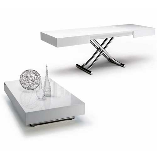
Duffy London’s Transforming Coffee Table MK1 (pictured below) has legs that fold underneath its base for  a very simple conversion. When the legs are in the elevated position, built-in leafs, which double as legs when in coffee table mode, add additional length to the dining room table surface.
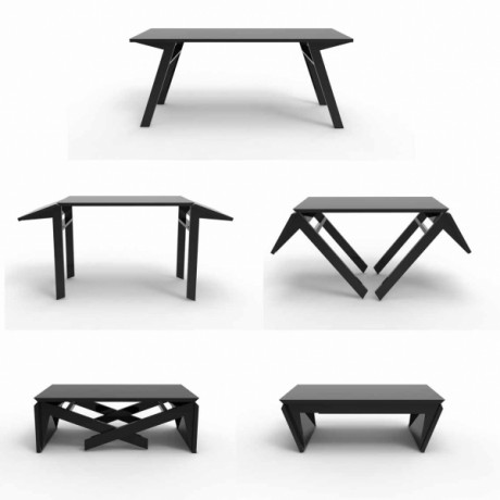
The table is offered in a variety of finishes and three sizes–Mini, Large and X-Large. All three are 13″ high in coffee table mode and 30″ in dining. The two smaller versions are 29″ wide in coffee mode and 50″ and 57″ when extended; the X-large goes from 39″ to 67″ wide. Duffy’s website lists the prices at £395/$638, £445/$718 and £595/$961 respectively. Unlike a lot of cool Euro furniture we’ve found, they offer US shipping at £175/$282.

Resource Furniture has a full line of tables that have both coffee and dining table functionality. Here are a couple.

The Passo goes from a 10.5″ high coffee table to 30.75″ dining table. It’s 30″ deep and width goes from 48″ closed to 78″ when its built-in leafs are folded out from under the tabletop.

Resource Furniture Passo Table

The Box table (pictured at top of post) is similar to the Passo, though the leafs project from the ends of the table versus folding out from underneath. Fully extended, the Box is 87″ wide–sufficiently large for dinner parties for 8-10 people. Like the Passo, you can extend one, both or neither leaf, giving a ton of flexibility for its usage. For example, you could have a long coffee table or short dining table.

We’ve had a chance to use both of Resource’s tables and they work great. They are high quality, easy to raise, transform and moving around the house. Both are available in a variety of finishes and start around $3500.

These tables are great investments for many, combing great design, materials and saving space functionality.  That said, we understand they are out of many people’s price brackets. If you know of high quality, lower price alternatives, let us know.

Via Dwell and Mimi

2 Housing Concepts Take Different Tacks for Concealing Cars in the City

According to Wikipedia, parallel-parking spaces, the kind that predominate in cities, use a whopping 182 sq ft. If you regularly park in cities, you know where this huge footprint comes from: There’s the length of the car, the space needed to pull out of the space and the irregular gaps that form when various-sized cars come and go. This latter factor often leaves spaces that are one foot too short for your car, rendering large swaths of prime real estate useless.

Considering that the micro-units we’ve been talking about measure 160-300 sq ft, the amount of urban area devoted to parking is a huge issue. A couple decidedly experimental housing concepts are taking different tacts in dealing with parking and living in the city.

The first is Aaron Cheng’s Parking + Housing, which is an entry in the James Dyson Award. The idea is that urban workers are typically not at home during the day, leaving behind tons of unused real estate. Commuters, on the other hand, come into the city and need space for their cars. P + H reconciles these needs by having a pneumatic structure that compresses during the day to provide parking for commuter (above). During the days, the structure extends to reveal a single-unit apartment (below). Furniture moves with space in its transformation (see video below).

Parking + Housing at night. Credit: Aaron Cheng

The idea, while interesting, has some big gaps in logic like late nights at the office. Do the apartment dwellers have to wait til the project is done? Or sick days. Do commuters need to park elsewhere?

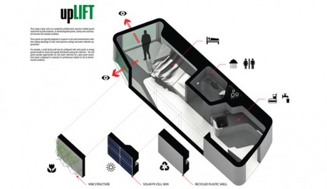
The other concept is called upLIFT, which inserts prefab housing units in existing parking structures, such as the parking elevators common in New York City (below). The project was part of the HOME competition run by Building Trust International, which sought to find single occupancy housing solutions for under $30K.

The panels of the structures are made of recycled material and designed to incorporate rainwater collection, solar panels and vine-walls.

What is interesting about upLIFT versus Parking + Housing is that it chooses to design around a less car-dependent future rather than accommodating commuters. Then again, it does little for the present, with it’s full lots and clogged streets.

Both of these concepts seem to dwell in possible futures more than suggest real solutions. In terms of real solutions, congestion pricing is a low-tech, yet effective way of keeping cities free of cars. What the often-unpopular-policy does is charge cars for entering certain zones of a city at certain times. London, a city who has instituted the policy since 2003, charges £10 ($16) for entering its congestion zone. One 2007 study found that traffic within the zone was reduced by 30%. While we couldn’t find parking statistics, it’s fair to say that there was a commensurate effect on parking as commuters who would otherwise park in the city leave their cars at home.

Of course, there are smaller cars and any form of two wheel transportation, both of which take up a fraction of the space that conventional car parking does.

What do you think? Should we design our cities with cars in mind or is that like laying new telegraph lines across the Atlantic?

Is Pinterest Making You Miserable?

A recent article in Canada’s Globe and Mail suggests North Americans are increasingly going on never-ending online searches for the perfect bedroom mirror and losing sleep over the colour of front doors. In other words, they are décor-obsessed. This phenomenon, they believe, might be ignited and fueled by TV makeover shows and online tools such as Pinterest, a site whose meteoric growth–3rd most trafficked site after Facebook and Twitter, with 20M new users in last year alone–is mainly attributable to home décor pinning. Pinterests boards of beautiful objects and interiors may inspire, but they might also remind you how deficient your home is.

The article goes on to blame blogs like DesignSponge, Remodelista and Apartment Therapy. The latter blog, one of our personal faves, put the subject out to its readers in a post called “Decorating Your Home: Hobby or Unhealthy Obsession.” Most comments resolutely declared their decorating habits were not problematic. They agreed that their desire to decorate was an issue of creating a great living environment, not an obsesssion. However, one comment astutely remarked, “I don’t think we are the right people to comment on this article, given that we are all here :)” [his emoticon, not ours].

This décor-dysmorphia may be the symptom of a larger societal issue–one the article suggests is more acute in women. The article reports:

The more social pressures women face, ‘the more likely they are to actively try to control the things they can, like the body or the home,’ says Joyce Davidson, an associate professor at Queen’s University who has studied how women express themselves through their home environments.

The evidence bolstering the G & M piece is anecdotal at best, but the thesis is logical: the more we see of great stuff and architecture, the more we realize our stuff sucks. If we have self-esteem issues (be honest), we’re going to try and get better stuff to bolster our feelings about ourselves. That works until that stuff is sucky too. This pattern is typically called a hedonic treadmill.

Of course this phenomenon, as people noted in both G & M and Apt Therapy’s comments, is not limited to home décor or women. The same thing could be said about gadgets, cars and food. It’s just that the recent growth of Pinterest makes it an easy target.

What do you think? Are home makeover shows, sites like Pinterest and blogs useful (or at least benign) tools for inspiration? Or are they shaking our self-worth, producing obsession through comparison and manufactured discontent? Let us know your thoughts?

Windy City Goes Micro with FLATS Chicago

Chicago adds its name to the growing list of cities that are building large-scale micro-unit developments with FLATS Chicago. The project is quite an undertaking. The development company, Cedar Street Co, has acquired seven buildings, representing 1200 apartments that will be converted into luxury apartments in the city’s rough-and-tumble Uptown and Edgewater neighborhoods.

Unit size will average around 350 square feet and be as small as 275. Amenities will include things like free wifi, washer/dryers in each unit, bike-shares, common spaces, rooftop pools and sports clubs. Projected rents range from $800 a month for a studio to at least $1,400 a month for a two-bedroom.

Rendering of Interior of FLATS Chicago

Jay Michael, one of Cedar Street’s partners, told Time Out Chicago that he wants to “sell singles on what he calls ‘FLATS life’: Common spaces are ‘an extension of your space’ where you can meet neighbors or entertain friends,” and that they are “targeting recent college grads who are ready to live alone,” who “for the same rent they’d pay for their half of a two-bedroom condo…can live solo at FLATS.”

Sounds good to us.

But there’s a catch: the buildings in question are dilapidated SRO’s, many of which, until recently, were occupied by impoverished residents. Though the developers want to make their units financially “approachable” to the existing tenants, the rents will likely be out of reach for most, and construction will inevitably displace them, even if that displacement is only for the length of the renovation.

While not obliged to do so, Cedar Street is working with transition coordinator Sherri Kranz to find housing for old tenants, many of whom have been in the apartments for more than 10 years. In one building alone, Wilson Tower, she’s working to find 60 people new homes–a challenge for people accustomed to paying as little as $475/month rent. She’s turning to city housing and nonprofits, though it sounds like sometimes the best she can do is get people on waiting lists. [Note: the SRO’s in question are not the “supportive housing” we talked about the other day, but rather privately held buildings.]

It’s the perennial gentrification conundrum. On one side are the under-served populations the buildings house. However, these building are, in Kranz’s words, “slums”–ones that in short time will be closed due to disrepair, making them a not-so-sustainable housing solution.

On the other side, the FLATS apartments will presumably serve large populations of city-dwellers, young and old alike, who are priced out of traditional apartments in more expensive neighborhoods.

Granted, there’s a big difference between having to get a roommate and being homeless, but it doesn’t negate the need for this type of clean, smart and affordable apartment.

Do you have any thoughts on these competing interests? Have you seen them successfully reconciled? Let us know in our comments section.

via Time Out Chicago

The LuxPod: Micro-Unit from Across the Pond

Japan, with  its one-room-mansions and Kyosho Jutaku homes, gets a lot of attention for small space living, but England deserves recognition as one of the small-space-living world capitals. The country is packed–the densest in Europe in fact.

According to The Guardian England has no minimum space standards! While this doesn’t create a lot room for storage, it does leave room for innovation…or, as The Guardian suggests, developers looking to pulp every dollar from every square foot.

Like the fellow London Yo Home! flat we looked at last week, we think the LuxPod falls in the innovative category. The experimental space was built in 2008. According to LuxPod’s website, it’s 11 sq m/118 sq ft, which is by no means the smallest space we’ve seen, but it’s pretty damn small. It was initially used as a vacation property. It is not clear what it’s being used for now (we’re looking into it).

It’s really an impressive little space. The finishes are top notch. There are a number of cool features like a retracting countertop that creates a dining bar. There’s a cool “wet” bathroom. All of the appliances and furniture look high end. The layout–as far as a 118 sq ft spaces go–is great.

The important thing to note about micro apartments like these is they are not intended for everyone. For example, when this author moved to New York City 11 years ago, 118 sq ft of my own would have been palatial. As there was nothing like this available, I had to share an illegally divided apartment with 4 other people. Two of the bedrooms had no windows.

There is a worldwide market for small spaces. Many people, like my younger self, want a clean space for themselves in major cities and beyond. Now it’s a matter of making them available, livable and affordable for the people who need them.

Photos by David Cowlard © 2008

Two Pieces of Wood, One Timeless Design

As Da Vinci famously put it: “Simplicity is the ultimate sophistication.” If he’s right, then this DIY Plank Chair by Jesse Hensel from Instructables is the pinnacle of sophistication. To elaborate much on its design would detract from its beauty. It’s two pieces of wood: one with a slot, the other beveled to be inserted in slot.

Before you ask, Hensel claims that it’s quite comfortable, but also says that you can adjust the angle to suit your preferred reclining angle. We imagine you could increase the width to make a Plank love-seat (though there might be considerations about stressing the wood). You could make the back higher, add cushions or add any number of other custom flourishes. In Instructables comments section, there are a number of similar versions with custom engraving, though we prefer simple aesthetic of Hensel’s version.

Making the Plank Chair requires a high school shop-class level of power tool mastery–something most of us could stand to have even if we didn’t want to make furniture. We imagine with a little cajoling and $30, your local lumber yard would make the cuts too.

Needless to say, the chair would store quite well.

The interesting thing to us is that this chair–which could be made from scrap wood–looks more timeless and durable than many offerings from large furniture retailers.

Go to Instructables to see detailed instructions on how to construct the chair.

Got any simple projects like this? Let us know.

Photo by Jesse Hensel

SRO’s at the Cutting Edge of Small Space Movement

In the 70’s and 80’s, single room occupancy (SRO) housing became synonymous with drugs, crime, totalitarian architecture and poor building quality. While the circumstances that lead people to SRO’s are still less than ideal (many are for the homeless population or very low income residents), a few architects are looking at what the buildings look like and what it means to live in them, designing innovative and supportive spaces for the populations they house.

Many SRO’s like the ones featured here enjoy a pass on restrictive building codes, allowing smaller unit sizes and larger communal areas than their conventional residential counterparts. Perhaps these developments presaged the upcoming micro-unit movement we’ve been talking so much about.

Harold and Margot Schiff Residence, Chicago IL

photo by Doug Snower

This building (also known as Near North Apartments or Mercy SRO) was designed by Murphy/Jahn Architecture, famous for O’Hare’s United terminal and Bangkok’s Suvarnabhumi Airport among many other large, notable projects. Charles Hoch, professor of urban planning at the University of Illinois told the NY Times that the design is a “stigma-smasher.”

The 96-unit building, built in 2007, borrows on “the cachet of Mr. Jahn to send a message to the larger society and that message is that homeless people have value, they have a role to play in society,” according to Hoch.

It is LEED silver certified, has solar panels and wind turbines that generate 15% of the buildings power and a grey-water recycling system (the first of its kind in Chicago). The ground floor features a large community space and the four top floors feature bright and airy units whose average size is 300 sq ft. Many of them feature views of downtown Chicago.

Bronx Park East, Bronx, NY

Before adAPT NYC, there was this SRO development by Jonathan Kirschenfeld, whose firm has done several similar sustainable “supportive housing” developments. The building, built in 2009, features triple-height street-side windows and 68 well-lit units with kitchenettes and private bathrooms. Units measure 285 sq ft, as supportive housing bypasses residential code that New York City spaces be 400 sq ft and up.

The development features a courtyard with a garden, a gymnasium and a double-height-windowed common room. Mr Kirschenfeld sees these kinds of spaces as integral to the intention of the space as he remarked to the NY Times: “Isn’t the idea here to improve mental health? Isn’t good architecture part of that?”

Another interesting aspect of Bronx East is its footprint, which utilizes an irregular lot.

Both of these developments show that innovation can come from unlikely sources and that good architecture and design need not be the domain of the rich.

If you know of similar innovative supportive housing, let us know.

Are Micro-Units Helping or Hurting Our Cities?

Last week, 33 development teams submitted to adAPT NYC–the Bloomberg-administration-supported competition seeking the best 275-300 sq ft/unit apartment building proposal [full disclosure: LifeEdited was on one of the teams]. According to the Wall Street Journal, this is three times the number of entrants similar competitions draw.

“The City’s adAPT NYC competition has ignited a global interest and conversation about how high-density urban centers can right-size their housing stock to fit changing demographics,” according to Mathew Wambua, commissioner of the housing preservation department.

Good news, right?

Well, not according to everyone.

This last Tuesday, a few thousand miles away in San Francisco, the South of Market Community Action Network (Somcan) took to the steps of City Hall to protest a proposed change in housing code that would permit dwellings as small as 150 sq ft.

Perhaps because of its proximity to Japan, San Francisco has been at the vanguard of small building in the US for some time. Unlike NYC, who demands new apartments have a minimum of 400 sq ft of living space (adAPT NYC is receiving a waiver on that), San Francisco already allows new spaces to be built as small as 220 sq ft. The Cubix SF, which has units as small as 230 sq ft, has been around for several years. An upcoming project by SmartSpace at 38 Harriet St in the SoMa neighborhood will feature 4 stories of 300 sq ft units.

We’ve seen SmartSpace before with a tour of their 160 sq ft experimental apartment, and we can’t help but suspect that this initiative is influencing the proposed legislation change.

What Somcan is protesting is the city’s ostensible shifting focus from family-friendly affordable housing to housing for affluent, childless singles and couples. This is taken from Somcan’s Facebook page:

SF has yet to meet its SF Housing Element plan of prioritizing affordable family housing units and yet creating housing for the new techies in the neighborhood seems to be first on the agenda. With less families in San Francisco means less family-friendly city and less funds for our public schools. It will be competing with the minimal land that the City has which can be use for REAL affordable housing. This type of development could possibly be catastrophic to our neighborhood, displacing low-income families, singles and existing residents

They might have a point: mico-units are not family friendly. They are primarily for singles and couples without children. The construction of micro-units could be construed as an elevation of their needs over those of families. And while there are no protests (yet), the same could be said of adAPT NYC.

What complicates Somcan’s argument is:

  1. Market demand. Singles and couples need affordable housing too. SF micro-units will start around $1300/month, far lower than the $2300 median price for a studio in that neighborhood.
  2. Smart design actually makes these spaces more livable than comparable, larger spaces.
  3. As cities grow denser, a fundamental shift in living spaces will have to be made. NYC, for example, expects nearly 1M new residents by 2030. The city says 85% of the housing stock for those people is already built, so redistribution of current spaces and new types of buildings will be essential to accommodating these people–whether they are singles, couples or families.

It’s a tough situation. Indeed, many cities like San Francisco and NYC are becoming prohibitively expensive for families. Yet singles and couples need affordable places to live.

Then again, maybe 150 sq ft is just too damn small (though the Japanese would have room to spare). Maybe really small legal micro-units would make cities the near-exclusive domain of singles, driving out all but the richest families. And maybe these dinky digs would open the gates to exploitation–already a problem in space-strapped places like Hong Kong, Singapore and London. Perhaps there is such a thing as too small.

We’re obviously more in the pro-micro-unit camp. We think they portend a fundamental, and positive, shift in the way people live in the city and even beyond. We also believe they can be scaled up for any type of household. But we’d love to hear what you think? Are micro-units providing affordable, smart and efficient housing for tomorrow’s urban dweller? Or are they displacing families and existing tenants in favor or “new techies”? Let us know your thoughts.

Clarification: San Francisco’s current code allows 220 sq living spaces, with 70 sq ft additional for kitchen and bathroom (290 sq ft total). A proposed change in code would allow for 150 sq ft living space with 70 sq ft additional for kitchen and bathroom (220 sq ft total).  

photo Kristy Leibowitz/NY Post

The Home of the Future or Weird Curiosity?

The England-based Yo! Company is a branding and investment firm that brings Japanese-tinged enterprises to Western territories. Among its holdings are Yo! Sushi, a conveyor belt Kaiten sushi bar in London and Yotel, a Japanese-style hotel with compact-rooms that has locations in London, Amsterdam and New York City.

Now Yo! Co founder Simon Woodroffe is bringing his Japanglo magic to the home market with the Yo! Home. The 800 sq ft London concept home aims to take us out the “agricultural, primitive age” he believes we live in now and into the future–a time when people will ask “do you remember when they had one space and it couldn’t change around?”

The Yo! Home changes around alright. There is a bed that descends from the ceiling and covers up a huge lounge area. There is a dining area that pops up from the floor; the same floor that hides a wine wine cellar. The kitchen hides completely. The guest room has a large sliding door that opens up to increase the area of the main room.

The space relies on a fair amount of automation, some of which broke down during his tour with Channel 4 News (above). To be fair, this is a prototype and breakdowns are to be expected. We do wonder about the long-term implications of an automated home. What happens if you’re really tired and can’t get you bed down?

Woodroffe spent £200K on the Yo! Home (~$325K US), which actually doesn’t seem like a lot seeing as how elaborate the space is. He thinks it’ll initially be for moneyed clients, but believes the technology and designs will eventually trickle down to the greater public.

Our hats are off to Woodroffe and his bold enterprise. Architectural thinking often gets fossilized because structures are imbued with a sense of permanency–so architects and designers avoid risky designs like these; ones that might look weird a few years from now. Concepts like Yo! Home loosen the noose of conventional thinking. They are invaluable idea-generators even if some of its features don’t make the final draft of the home of the future.

What do you think? Is this home the future or a curiosity–something that’ll look weird and overwrought 5 years from now? Let us know what you’re thinking.

Photography is by Ashley Bingham

Via Dezeen

3 Big Stores Get Into Small Spaces

There was a time, not so long ago, when furniture stores assumed their customers wanted items that would fit well in an over-sized dream home. Furniture was marketed with easy mortgages and cheap credit in mind. Well, those days are over.

With more people living in square-footage-starved cities, and more people renting, a growing population is reevaluating the dimensions of their dream home. A few furniture retailers are taking heed of this trend, marketing specifically to consumers living in small spaces.

Restoration Hardware released its “Small Spaces” collection earlier this year. It is, they claim, “A collection of epic proportions.” It’s sufficiently important to the company that it’s on their site’s main navigation bar. The collection is shown in 15 “small” spaces from around the world like the “Chelsea Penthouse” or “London Townhouse.”

These spaces don’t seem that small to us, and there are no dimensions to contradict our impression. The furniture looks suspiciously similar to other pieces in the catalog: the big space love-seat becomes the small space couch; the end-table becomes the coffee table. Perhaps it’s relative. Maybe RH is catering to people who are transitioning from 4K to 2K sq ft of living space.

IKEA has been in the small space fray for a while now. The video below shows a number of ways you can use their products to squeeze tons of utility from a small space. They claim small space living is “not about giving up your dreams. It’s about shrinking them, just a little bit”–whatever that means. The video is pretty creative and compelling.

Many of their stores feature 375 sq ft mock-up apartments. The author visited one the other day and found the layout pretty nice.

The furniture in the apartment, like RH, seemed like their normal furniture plugged into a small space. Unlike RH, IKEA seemed to understand the necessity for storage in a small space; there were shelves everywhere and two of the walls had large storage systems.

They made what seemed like a strange choice, decking the living room with a big couch. It was strange until you sat in it and realized that a comfy couch is pretty important to demonstrating a space’s livability.

West Elm also features a small space collection. A couple of their pieces actually seemed to be designed for small spaces–not just a normal piece with a small space sticker slapped on it. In particular, the Storage Bed Frame and Rustic Storage Coffee Table (below) would be useful additions to a small space. The latter model’s tabletop lifts to provide a desk space if you find yourself working on the couch.

What do you think of these collections? Are they marketing gimmicks or indicators of they way people will live in the future? Or both? Have you bought any of these products? What was you experience? Let us know.