Transforming Space Must Be Seen to be Believed

With an average purchasing price around $23K per square meter, it’s no wonder that some of the world’s most amazing transforming spaces come from Hong Kong. And this apartment by HK’s LAAB Architecture might be the most most versatile transforming space we’ve ever seen. The owners, Michelle and Andy, were dead set on living in HK’s extremely expensive Central District. Rather than cashing blowing all of their money on a larger place, they decided to go small and employ smart design to fulfill on their desires. And their desires were many: They wanted a full kitchen, large bathtub, home cinema, gym, cat friendly spaces (there are three) and plenty of storage. All in 309 sq ft.

How LAAB fulfilled on the brief must be seen to be believed. Some of the highlights are a tub that doubles as a seating area, an entertainment center that slides out of the wall, sleeping for 4-6 and, perhaps most impressive, a network of “catwalks”–tiny corridors for the cats to play in. The architects said the build necessitated 3mm tolerances to make everything work. Needless to say, most everything is app controllable.

laab

Laab-floorplan

Central to making the apartment work was the “Form Follows Time” philosophy, where the space morphs according to the time of day and its attendant use. It’s a concept we’ve long espoused here and on we hope gains traction in architectural thought. LAAB’s fusion of high tech, high design, amazing craftsmanship and lofty thinking has truly set a high watermark for what’s possible in space small and large.

Images via LAAB

Norway’s Small Space Royalty

We recently ran across Norwegian company “Ett rom til” (One More Room) on one of our favorite design sites, Living in a Shoebox. They showed off one of the firm’s projects that placed a spare bedroom in an apartment’s entryway (pictured above). But checking out Ett rom til’s website revealed a whole universe of ingenious space-saving designs. The company are masters of chopping up small spaces and giving them tons of functionality. They have several wall bed designs, but their main tool is the loft: in living rooms, kitchens, bedrooms and, as mentioned, hallways. Take a look. 

ett rom til-kids-swing ett rom til-kitchen-loft ett rom til-studio ett rom til-murphyett rom til-desk ett rom til-girls-room ett rom til-loft

More at Ett rom til

Petite Apartment Packs Pivot Power

Robert Garneau is no stranger to ingenious small space design. The NYC-based architect’s Transformer Apartment, with its host of custom storage solutions and transforming elements, is one of the most publicized micro apartments in the last decade. Last year, Garneau’s new practice Architecture Workshop PC received an NY AIA Honor award for their Pivot Apartment, which takes an innovative approach to creating spatial divisions in a small NYC prewar studio.

pivot-apartment-dining

Similar to the MJE House by Spanish architects PKMN, the Pivot Apartment uses a pivoting wall to split the 400 sq ft space (yes, Garneau has a knack for descriptive naming). When the wall is closed, it creates an open space with enough room for a table with seating for ten (table collapses when not in use). When the wall is open, it reveals a wall bed and an array of cabinetry. The two cabinets skirting the bed extend out and include ample clothes storage.

pivot-apartment-livingpivot-apartment-storage

White walls, cabinets and blonde wood throughout the apartment keep the space looking bright and airy.

Photo credit: Robert Garneau

HT Robert T

Video: The Year of Magical Furniture

When we cover interesting compact spaces on this site, we usually list their usable area, expressed in square feet or meters. We are pretty hardwired to draw a correlation between a space’s area and functionality. Even when we take pains to list the functionality first, it’s always couched in the “wow, you can do that in a small space?” But what if we decoupled space and functionality altogether? You see, listing area is a conventional approach to understanding space. It’s something easy to wrap our heads around and measure with a stick. But area often misrepresents the gestalt–i.e. the sum total of architecture, furniture, embedded technology and the other UX elements that can help a space transcend its physical dimensions. This talk by Hasier Larrea places special emphasis on the role of furniture to determine how a space performs.

His thesis is that architecture has barely changed in the last 2K years. We keep making static spaces, single function rooms filled with “space killers”–things like beds that lay waste to a space’s functionality the moment after they’re used. He proposes that we augment spaces with transforming elements–ones that are effortless and magical–to create spaces that are alive around the clock.

Larrea knows a thing or two about this subject. The MIT Media Lab alum was part of that school’s CityHome project, which created a high tech furniture module that endow small spaces with tons of functionality. He is now the CEO of MorphLab, a startup that is out to make robotic, open API furniture modules to kill the space killers that not only doom a space’s action potential, but also create a dearth of affordable housing in cities across the globe. He and his team are trying to create a future where our homes and other spaces magically change form to meet our needs.

IKEA Takes on Transforming Interior Design and Furniture

The moving wall in the LifeEdited apartment was one of its most innovative and useful features. Not only did it house an office, a projection screen and a bunch of storage, but moving it out divided the studio space into a three room apartment. A lot went into its design. The carriage and track were custom made by Modern Office Systems–a company whose stock and trade are library walls and corporate file storage. The track had to be attached to the floor joists and the rails were built into the floor. The cabinetry on top of the carriage was all custom made as well. All of this put the cost somewhere around $23K, which doesn’t even include the cost of installation. It was money well spent, but it was a lot of money nevertheless. If you want all the moving wall functionality without the huge pricetag, IKEA (who else?) might have you covered. For the last couple years, their R&D department has been concepting their own moving wall that could bring transforming interior design to the masses.

ikea-moving-wall-open

The wall system has been set up in an apartment in Malmö, Sweden. Sweden, like many places, has been experiencing a real estate crunch and IKEA has been looking for ways to bring cost-effective ways of maximizing space. According to the Wall Street Journal, IKEA has let eight families, of varying compositions, take turns living in the apartment. Mikael Ydholm, IKEA’s head of research, says the design team has been tweaking the design as much to the participants’ emotional response as its functional value. Ydholm is quick to point out that the design is still a concept and a good three years out from production.

The WSJ spoke to PKMN’s David Pérez, who knows a thing or two about moving wall. He expressed suspicions about the wall’s viability. “The most important thing is not the movable wall,” he told them. What he is referring to–which are exactly the challenges LifeEdited faced installing our wall–are the myriad other considerations when installing such a large piece of furniture into your space: making sure there is a constant distance between floor and ceiling, making sure your floor can support the weight of the wall, installing supports to make sure the wall doesn’t tip over and especially electrifying the wall. In PKMN’s MJE House that we featured the other day, the moving wall pivoted on an axis, making it relatively easy to electrify (easy for me to say) as their was a fixed point to run electric through. In the LifeEdited apartment, because the entire wall moved, we had to run a retractable extension cord as creating an electrified “third rail” was neither feasible nor safe.

All that said, the concept is pretty badass and I could imagine IKEA producing some sort of simplified, un-wired storage on casters. More than anything, it’s exciting to see such a large company thinking about how furniture and interior design can allow people to extract more function out of their existing spaces.

Via Apartment Therapy

A Small Apartment for All Seasons and Whole Family

One of the most interesting and talented architecture firms specializing in small space design is Spain’s PKMN (aka pacman). We looked at their “ALL I OWN” apartment–a budget conscious transforming space whose moving walls shifted throughout the day with its owner’s needs–as well as “HOME BACK HOME”–a small space interior design concept that dealt with the trend of Millennials living at home a little longer than expected (if they ever left at all). Their latest project is entitled “MJE House”–part of a series of sorts called PEQUEÑAS GRANDES CASAS (Little BIG Houses). With the help of its large, pivoting walls that create various spatial divisions, the house might possess one of the most flexible formats we’ve ever featured on this site.

The space was designed for a couple whose primary residence is in Mexico, but also needed a home in Europe, where they spend a good portion of the year. PKMN’s objective was to create a space that accommodated the couple’s whole family including children and grandchildren. They wanted a home that moved around them and their lives rather than the other way around.

PKMN began the renovation with a modest, rectangular 50 sq meter (528 sq ft space) 65 sq meter (699 sq ft). Along the perimeter of the space are a number of builtin elements: a good sized galley kitchen, storage, an office that folds out of the cabinets, a table that stows away and more. But the stars of the space are the two, huge moving walls. Both pivot on an axis and roll along casters; both walls are connected to the house’e electric adding significant functionality. Depending on where the moving walls are placed, rooms can be made. One wall contains a wall bed on one side and the TV on the other; the other wall has a wall bed on one side and storage on the other. Along with another wall bed fixed to the wall adjoining the kitchen, the house sleeps five (very friendly) people. There are also doors that can completely seal off both of the bed areas (“room” is a loose term in this space).

The bathroom, kitchen and a couple nook spaces along the windows are the only areas that can be considered fixed–everything else moves and can be used in multiple ways, allowing the apartment to function like a space twice its size. 

Bleeding Edge Furniture Technology

While there’s a certain novelty about space-saving, transforming furniture–dining rooms that tuck into floors, automated, disappearing bedrooms and so on–its impact on architecture can be real and profound. It might double or triple the utility of a given room, leading to diminished real estate needs, leading to less sprawl, leading to less driving, less waste, smaller carbon footprints and a shot of mitigating the profound damage humans have done to the planet (sorry, but it’s true). It’s an impact big enough to warrant big brains and focus, which is exactly what furniture upstart RockPaperRobot is all about. RPR was founded and is run by Jessica Banks, who holds a PhD in robotics from MIT, a pedigree that shows up in RPR’s new Ollie line of transforming furniture.

Previously, RPR had focused mostly on designing and producing high end furniture that, through creative engineering, appeared to defy the laws of physics–tables that seemed to levitate or rest on a pinhead. These pieces also defied most people’s furniture budgets. While they continue to produce these premium products, Banks wanted to make furniture that was more accessible functionally and financially to more people, which is how Ollie was born.

“We saw a number of trends such as urbanization and the desire to live life with less stuff and more experiences,” Banks told me about the Ollie line’s inspiration. She also saw how the phenomenon of FOMO [fear of missing out] could apply to the objects in our lives. “Most furniture is like, “If I buy this, I can’t do this,’” she said. For example, if I have this full-sized dining table, I can’t have open space to do yoga. “We asked ‘Why should furniture prevent us from doing what we want to do?’”

The Ollie line includes a table, stool and chair, all of which effortlessly transforms from full-sized furniture into super slim storing proportions, giving rooms double and triple functionality. The furniture is both lightweight and sturdy (a rare combination I’ve found). Aesthetically, I would call it industrial chic. The customizable slats are easily swapped to match a room’s decorative needs.

Beside the obvious residential applications, Banks told me that they have been discussing using the furniture in commercial spaces in order to optimize for traffic patterns. For example, a coffee shop with a ton of foot traffic in the morning could deploy Ollie tables in the middle of the day for loitering freelancers (the author knows of which he speaks).

I asked Banks if her robotics training helped in designing the collection. “Definitely,” she replied. “The tables are more like a transmission than tables. They’re highly engineered with 60 moving parts and 300 total parts. We had to make everything work together and calculate for forces.”

RPR is currently readying the tables and chairs ready for production and says they will be taking orders in three months for the chairs and six for the tables (they will also do custom manufactured pieces anytime you want).

YO! Home So Small You Gotta Put Your Bed on the Ceiling

When I posted about the YO! Home prototype apartment a few years ago, I was impressed with its features: the big lounge, the hydraulic table and seating that sprung from the floor and, of course, the Darth Vader-worthy bed that dropped from the ceiling. But I also thought it more architectural confection than viable design. It was too flashy, too complex and, frankly, at 800 sq ft for what was effectively a studio apartment, too damn big. But like all prototypes, the YO! Home was and is a work in progress, subject to refinement and tweaking. Well, since we last looked at the YO! Home, Simon Woodroffe and his YO! Company have been doing a lot of tweaking…their prototype apartment that is. Their YO! Home Prototype 2 is subtler, simpler and smaller than its forebear, looking ever closer to something people would want to live in.

YO! Companies has some big ambitions for the little apartment, seeing it fulfill an important role in the global urban real estate market. YO! Home Managing Director Jack Spurrier wrote to me in an email, “YO! Home aims to transform the way we live. Space is at a premium in city centres around the world. YO! Home simply expands that space, and acts as the reinvention of the urban apartment, offering a completely new concept for compact living. The global recession has given rise to an additional compelling factor–funds for home buying are severely limited, therefore buyers are seeking maximum value (and space) for their money.”

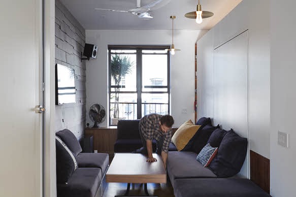
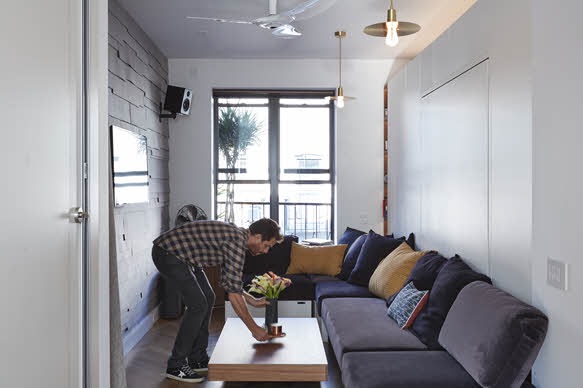
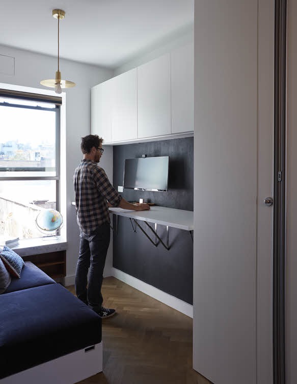
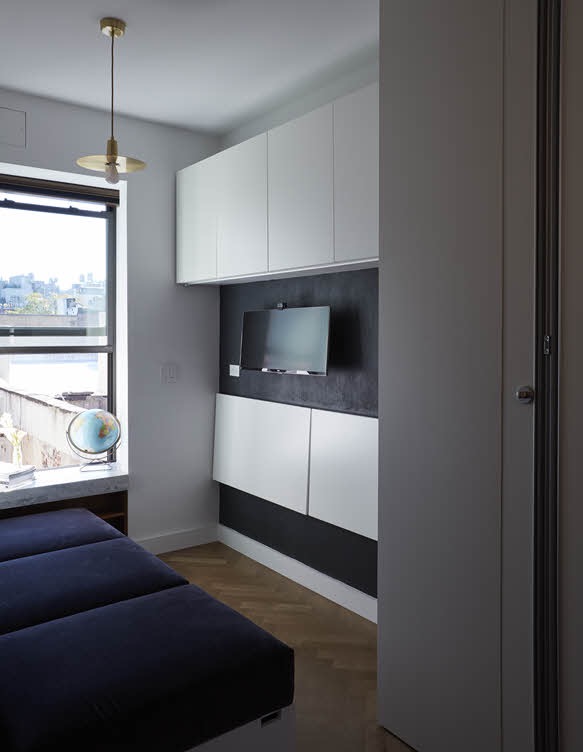
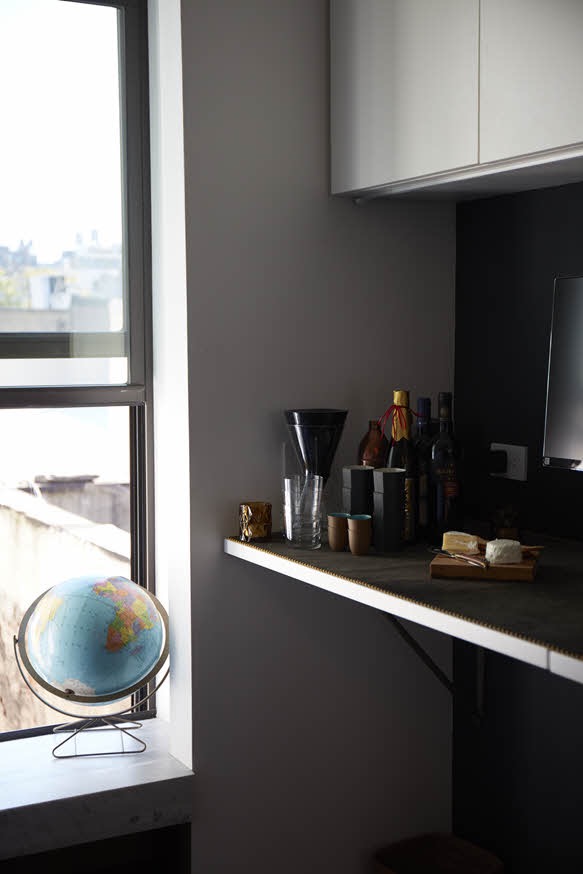
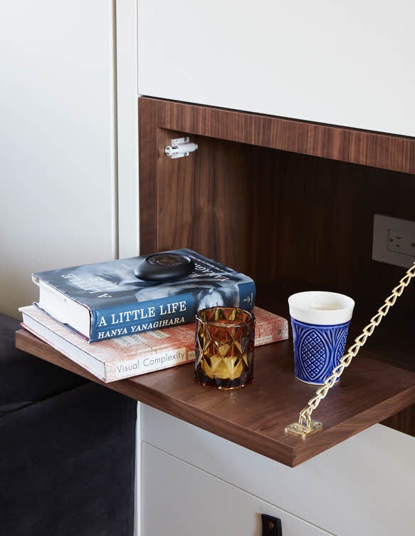
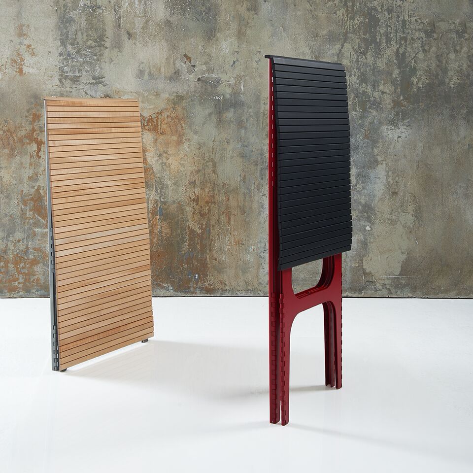
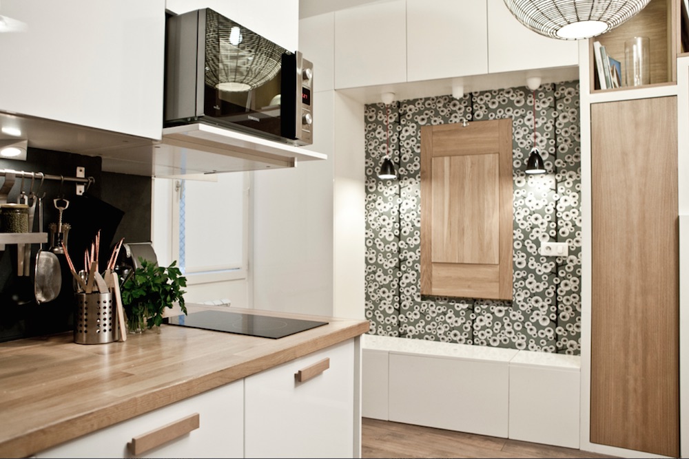
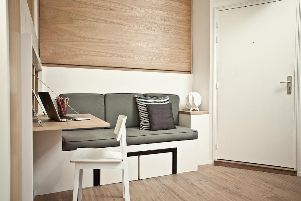
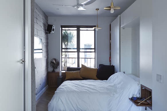
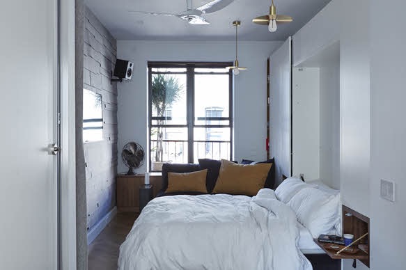
The new apartment has evolved quite a bit from the first. Spurrier said that the moving parts were tested and re-prototyped where necessary to ensure they were reliable enough to be marketed to the public (more on that in second). There was a major aesthetic overhaul, making the whole thing look a lot less flashy. Instead of various shades of red and purple, the new apartment has a muted color palette of whites and woods, giving a clean, less polarizing look.

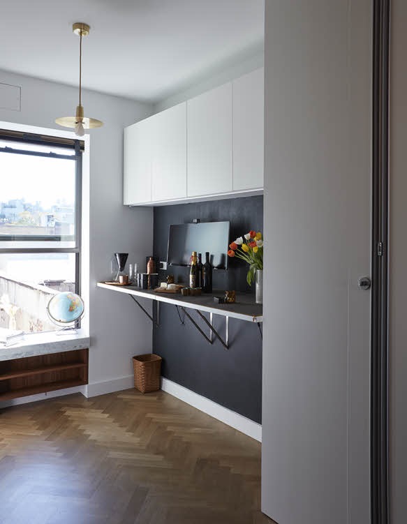
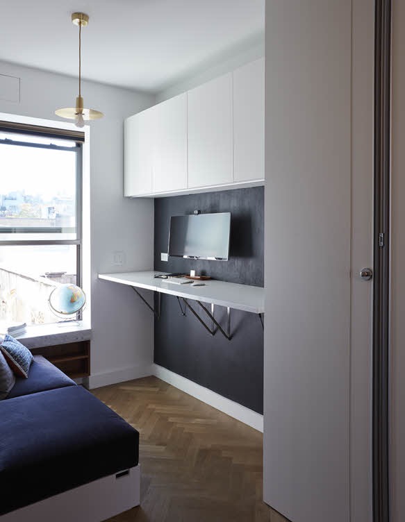
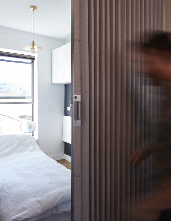
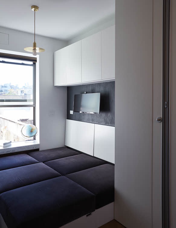
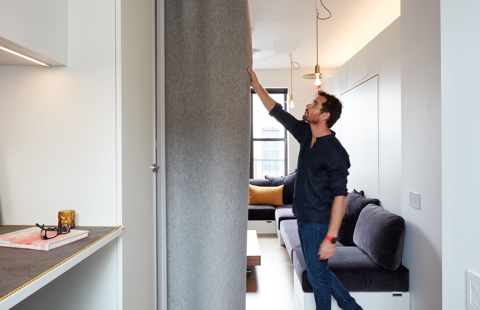
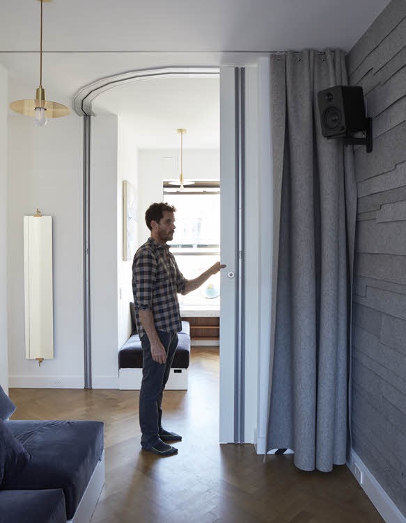
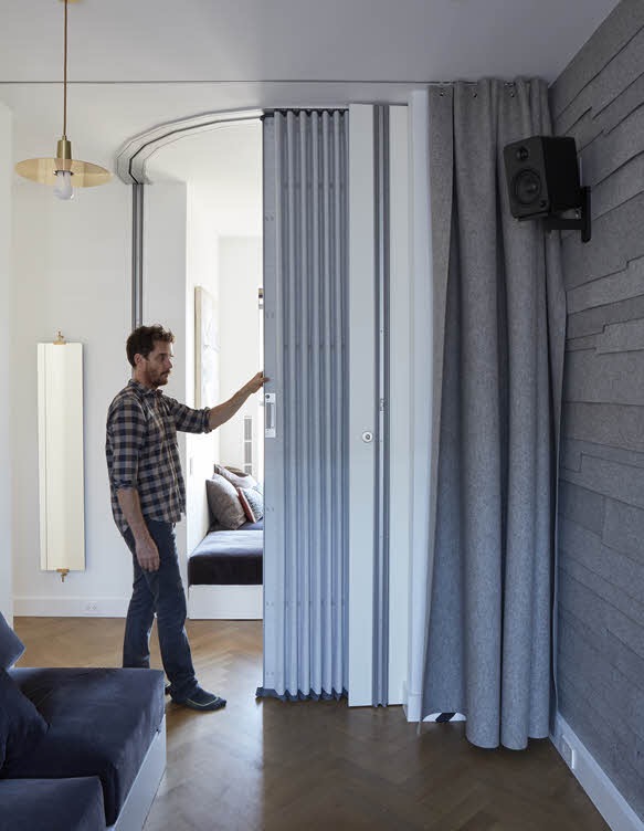
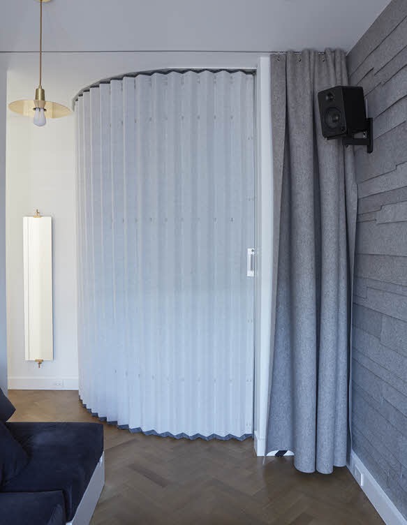
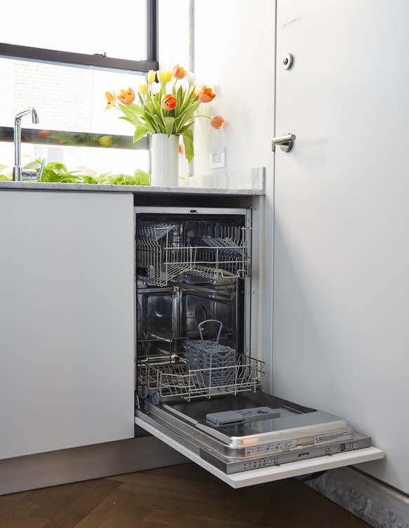
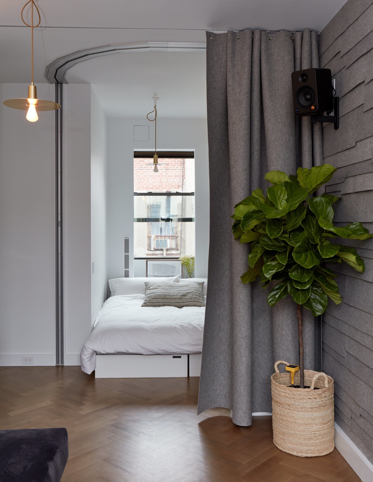
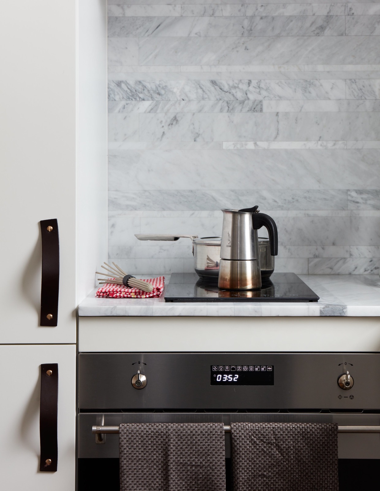
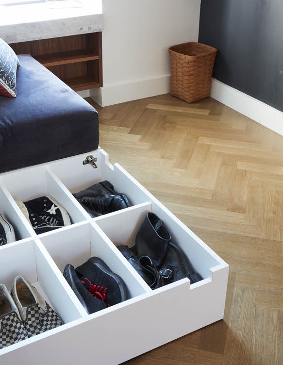
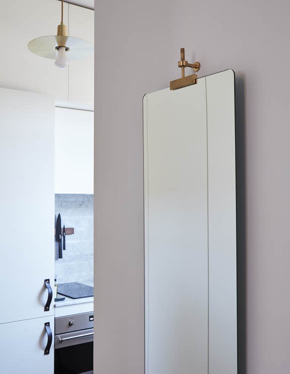
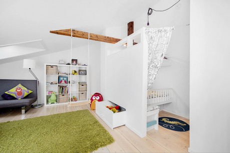
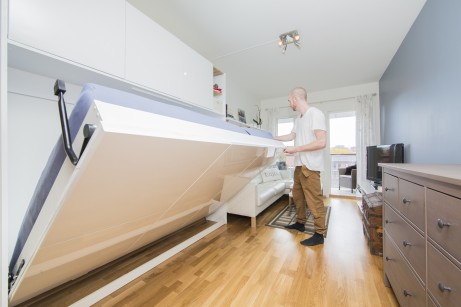
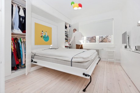
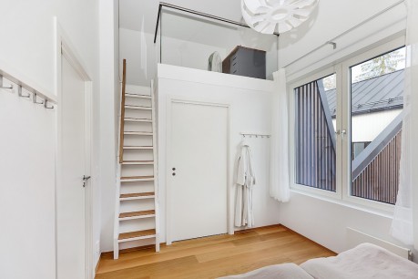
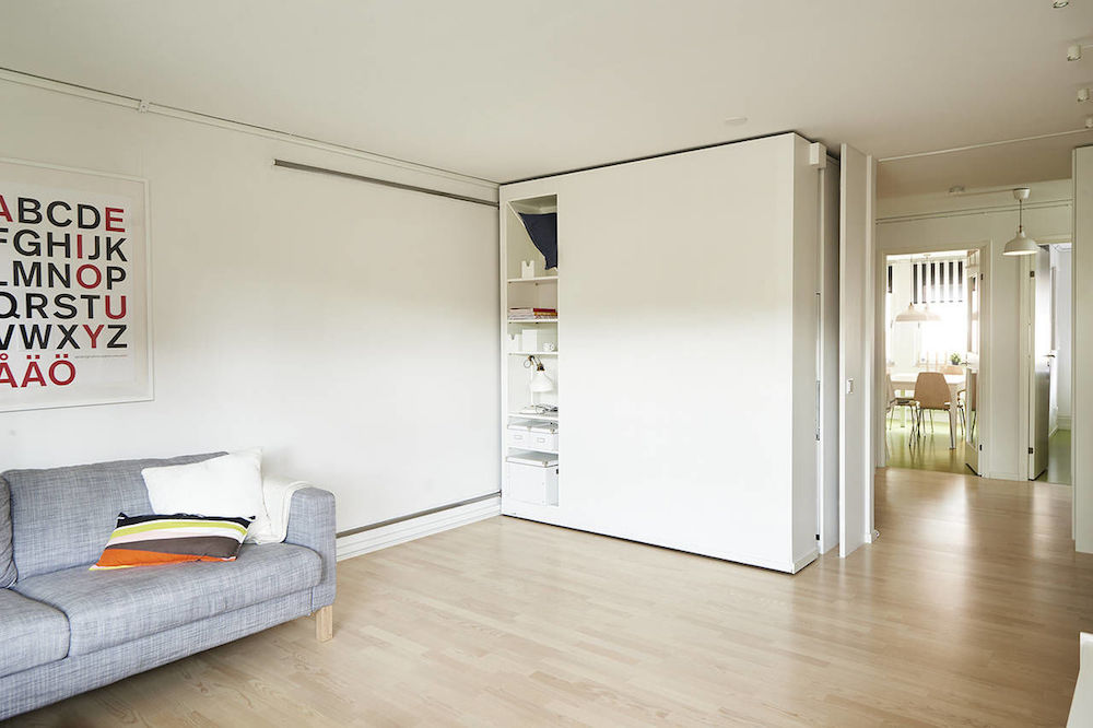
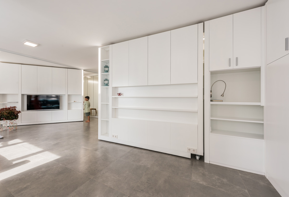
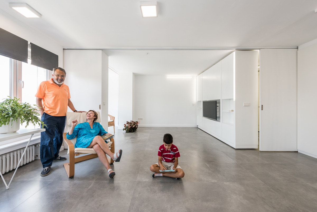
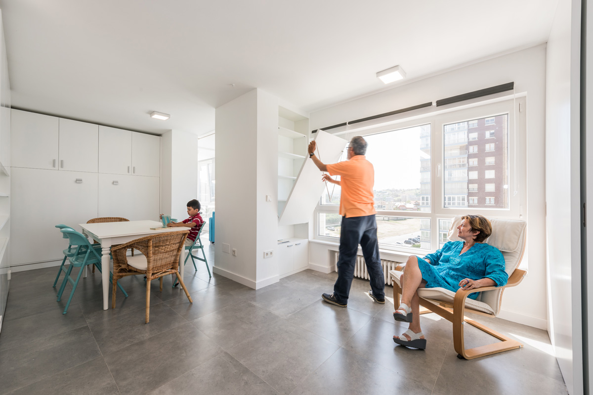
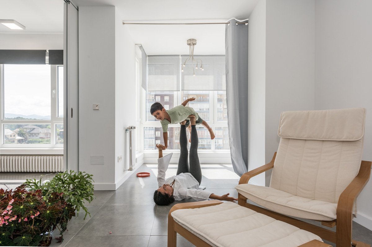
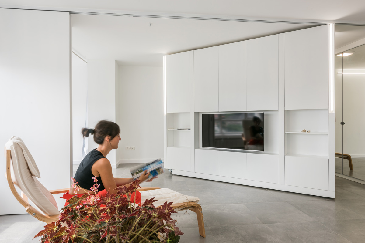
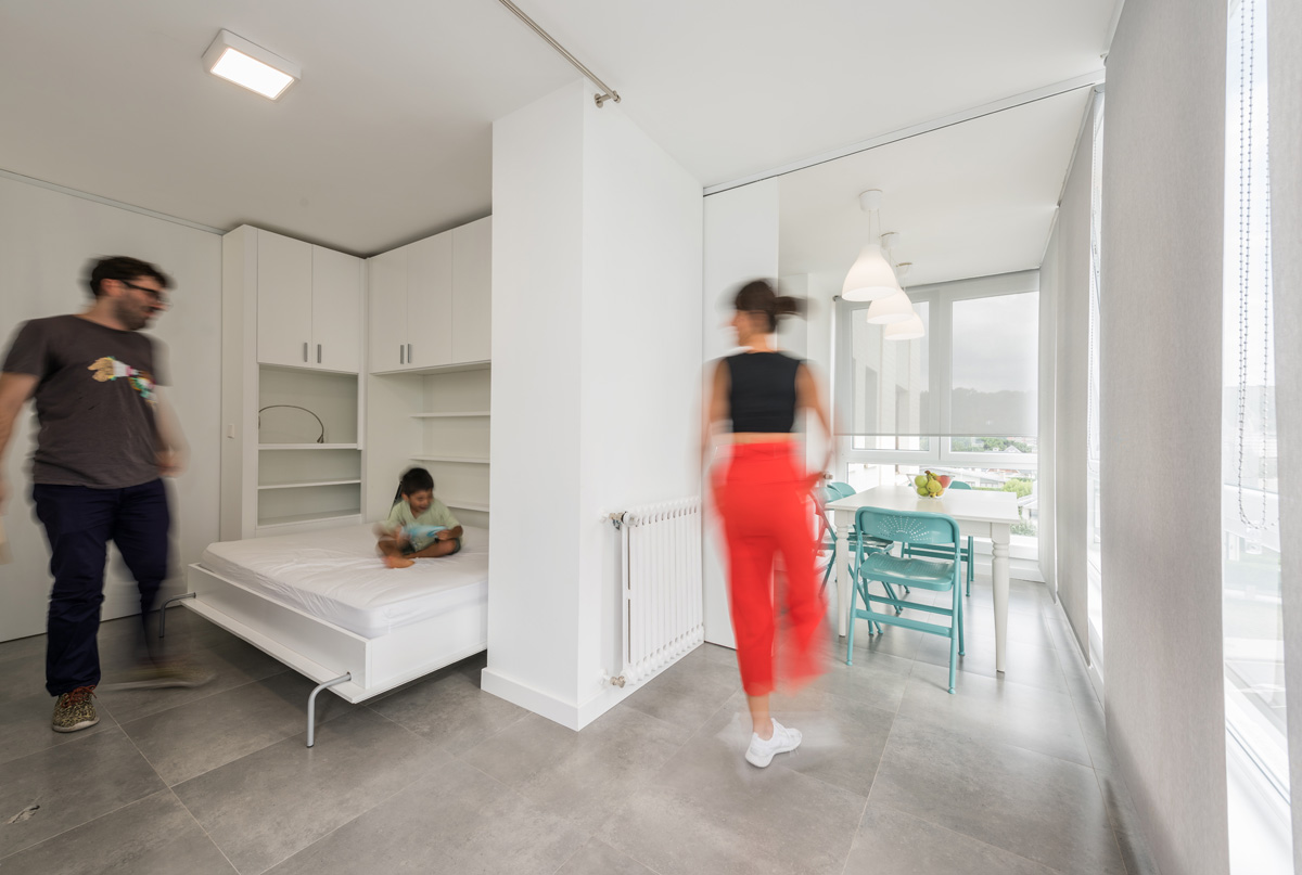
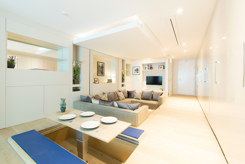
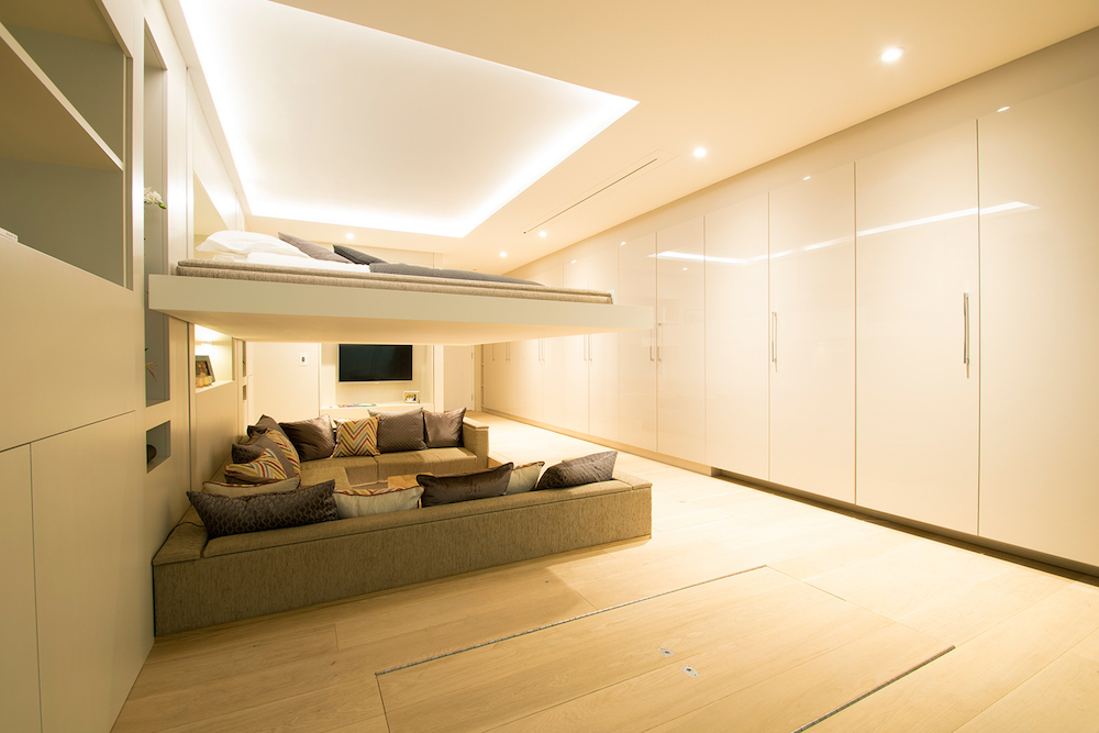
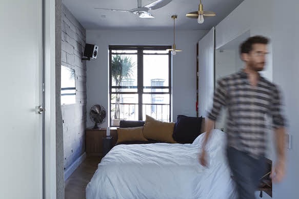
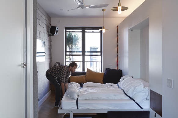
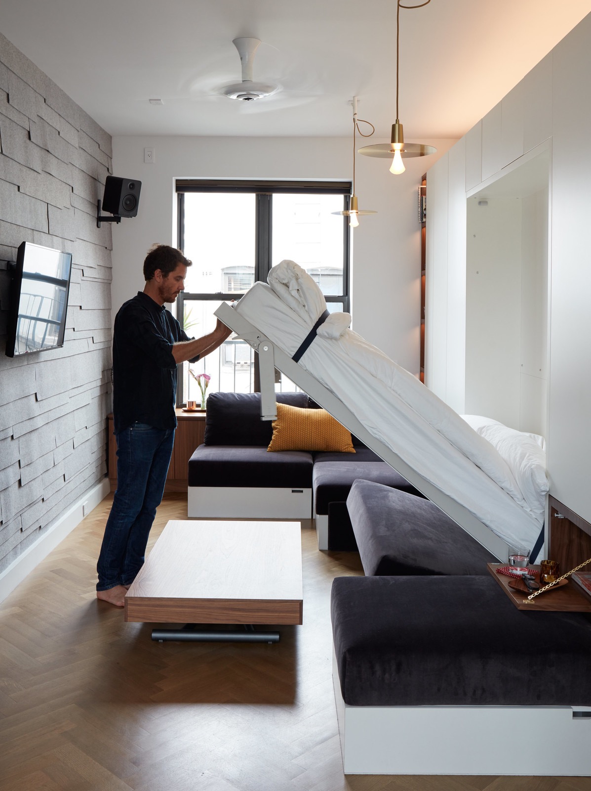
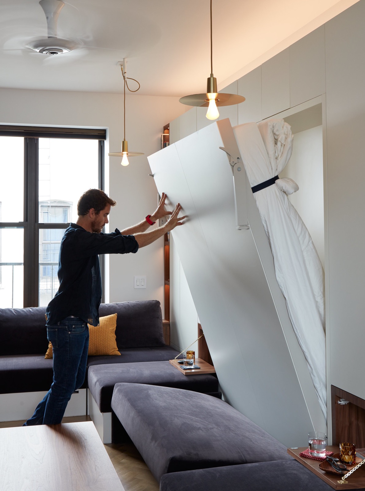
The apartment retains most of the functionality of the previous apartment, but at 430 sq ft, it is almost half the size. The whole interior sits on a raised platform, which houses storage as well as a telescoping dining table and seating area that hide completely when not in use. The lounge and sofa are half sunken into the platform, reducing the visual noise on the floor’s plain. There is still the same bed that descends from the ceiling to cover the ample lounge area. I’m still not convinced this setup is preferable to a wall bed considering the added complexity, though it is a big win for people who don’t like making their beds. It also frees up wall space for more storage. Speaking of, the walls are covered with tall cabinets as well as a hideaway desk and pocket kitchen.

Perhaps the most interesting thing about the apartment is that it will be the basis for an upcoming building in Manchester, England. The building will be made with 24 prefabricated units based on the Prototype 2’s design. Spurrier said that, “The size, space, layout and moving parts or ‘tricks’ are right in Prototype 2. There may be tweaks here and there for the Manchester YO! Homes, but these will be minor, and more likely aesthetic as we continually improve the look and feel of design details such as colours, finishes and lighting.”

If what Spurrier says proves to be true, this could be a pretty big news for transforming, compact architecture. While there have been a number of compelling furnished micro-apartments brought to market, most are fairly conventional in their execution. They are more or less well laid out studios with wall beds, built-in storage and appropriately sizes appliances and fixtures.

YO! Home is something altogether different. There aren’t many apartments that look or act like it, and if there are, they certainly aren’t for sale in quantities of more than one. Simon Woodroffe grandly said, “Since the invention of the city centre apartment, we’ve never really re-invented it. YO! Home is that new invention.” Looking at its elaborate design and clever features, I’m inclined to agree and look forward to seeing how the project unfolds.

Keep up with YO! Home on their website, Facebook and Simon’s Twitter.

Tiny Apartment Merges Transforming Design with Organic Style

There’s a tendency for tiny transforming apartments to feel like they’ve been designed by Optimus Prime. Often when you add furniture that folds into the wall, it’s hard for an interior to not have a futuristic, modern vibe. Which is why interior decorator Geraldine Laferte’s tiny “Duhesme” apartment is so successful–it merges transforming furniture with a warm, organic style.

The Parisian apartment measures a mere 193 sq ft, yet features a dining area, kitchen, lounge, desk, bed and bathroom. Laferte uses a mixture of warm woods and muted wallpaper to keep the place feeling anything but cold and futuristic. The transforming elements include a wall bed that sits above a built in sofa and there’s a small dining area with a table that folds into the wall when not in use; three cube-shaped stools serve as seating. The whole space is lined with floor to ceiling cabinetry to maximize storage.