The Slow Death of the Walkable City

As a bit of an urban planning enthusiast, I’ve often wondered how cities that predate widespread car-ownership can be so car-dependent nowadays. For example, I am from Chicago, a city that was booming well before the Model T hit the assembly line. Yet today, there are large swaths of the city that are, for all intents and purposes, inaccessible without a car or a ton of patience for public transit.

The fact is most cities that predate ubiquitous car-ownership were far more walk/bike/public-transit friendly than they are now. Their cityscapes were characterized by dense housing on small lots connected by narrow streets. People walked, biked, rode horses or took streetcars to get where they were going. Without cars, people had to live close to their work, stores, etc.

In the mid 20th century, much of this density was lost to make way for the car, a fact illustrated so well by these maps published by the University of Oklahoma’s Shane Hampton. He writes of the contrasting views:

60 years has made a big difference in the urban form of American cities. The most rapid change occurred during the mid-century urban renewal period that cleared large tracts of urban land for new highways, parking, and public facilities or housing projects. Fine-grained networks of streets and buildings on small lots were replaced with superblocks and megastructures. While the period did make way for impressive new projects in many cities, many of the scars are still unhealed.

Indeed, the pictures show cities eviscerated by highways. Semi-occupied lots fill the spaces where tightly packed housing once stood. Wide arterial roads replace narrow streets. It is a picture of sprawl.

What’s interesting is that many of the cities featured have experienced economic decline in the last 60 years. On the other hand, cities like San Francisco, Boston and New York City that did not undergo such profound transformations (not that people didn’t try), have remained economically vital.

As with many things, the answers to present and future problems can often be found in the past. The older pictures show that we know what to do, how to build and how to make cities vibrant, walkable and sustainable. If we can build that type of cities once, we can do it again…at least one can hope.

See more interactive maps on the University of Oklahoma’s Institute for Quality Communities website

Hat tip to Lloyd

Photographer Captures Poetry and Perils of Sprawl

Few things provide context for a place like an aerial view. When we only see what’s in our immediate field of vision on the ground, it’s tough to understand how we fit into the world around us. Gaining this larger perspective is what photographer Christoph Gielen achieves with “Ciphers,” a collection of shots showing suburban sprawl as seen from above. His examples, which are as varied as prisons and retirement communities, show an undeniable visual poetry to the patterned layouts of the homes.

Gielen also brings to attention the environmental impact sprawl, which is almost entirely dependent on cars to access. He writes on his site:

The goal of this work is to connect art with environmental politics and to trigger a discussion about contemporary building trends by looking closely at the ramifications of sprawl – to ask: what is sustainable planning? – particularly at this point in time, when a growing need for new housing is prevalent across the globe.

The images mostly speak for themselves, but one of the things not explicit is location: most of the developments Gielen chooses are former marshes of Florida or deserts of Arizona, Nevada and California–places that, in their natural states, are barely inhabitable are now blanketed with homes.

Sprawl is the byproduct of the notion that there was and always will be unlimited resources–unlimited gasoline to drive us further and further from city centers, unlimited money and materials to keep building and maintaining ever-growing homes, unlimited water to make prairie grasses grow in the desert. In our process of rethinking these misbegotten notions, people like Gielen provide visual demonstrations of where we’re at so that we might determine where we’re heading.

via Treehugger

Sprawl Messed Up

Forgive us if we seem like anti-sprawl-ites, but evidence keeps mounting that sprawl is neither planet nor people friendly. A study commissioned by Smart Growth America called “Measuring Sprawl and its Impact” looked at 221 metropolitan areas and 994 counties in the United States. The study sought to find out if there were connections between sprawl and social issues. Here’s what University of Utah professor Reid Ewing and doctoral research assistant Shima Hamidi–the study’s main authors–found out:

Several quality of life factors improve as [sprawl] index scores rise. Individuals in compact, connected metro areas have greater economic mobility. Individuals in these areas spend less on the combined cost of housing and transportation, and have greater options for the type of transportation to take. In addition, individuals in compact, connected metro areas tend to live longer, safer, healthier lives than their peers in metro areas with sprawl. Obesity is less prevalent in compact counties, and fatal car crashes are less common.

More specifically:

  • Traffic accidents were slightly more frequent in compact areas, but there were twice as many fatal accidents in sprawling areas.
  • Residents in sprawling cities spent more on combined transportation and housing expenses than compact cities, 52.1% and 51.1%, respectively.
  • Compact city dwellers had a longer life expectancy: 78.4 years versus sprawlers 77.7 years. Moreover, “For every doubling in an index score, life expectancy increases by about four percent. For the average American with a life expectancy of 78 years, this translates into a three-year difference in life expectancy between people in a less compact versus a more compact county.”
  • The average sprawling man was two pounds heavier than the compact one.
  • In terms of economic mobility, “For every 10 percent increase in an [sprawl] index score, there is a 4.1 percent increase in the probability that a child born to a family in the bottom quintile of the national income distribution reaches the top quintile of the national income distribution by age 30…For example, the probability of an individual in the Baton Rouge, LA area (index score: 55.6) moving from the bottom income quintile to top quintile is 7.2 percent. In the Madison, WI area (index score: 136.7) that probability is 10.2 percent.”

The aforementioned sprawl index is a scale based on “four primary factors—residential and employment density; neighborhood mix of homes, jobs and services; strength of activity centers and downtowns; and accessibility of the street network,” according to the study. An index score of 100 represents the national average. Anything above 100 was considered compact and below, sprawl.

Predictably, with a score of 203.4, NYC was the most compact large metro area. Predictably as well, with a score of 76.7, Houston ranked as the most sprawling large metro area; in fact, eight of the ten most sprawling large cities were in the south (technically, the other two cities rounding out the bottom ten–Riverside-San Bernardino/Ontario, CA and Prescott, AZ–are southern cities).

most-compact-citiesmost-sprawling-cities

There was a pretty big drop off from second ranked San Francisco at 194.3 to third ranked Miami, at 144.1. These scores hint at how sprawl still pervades most American metro areas. Despite many indicators pointing to a more compact, urban America, there was a 1.4% increase in sprawl between 2000-2010. With few exceptions, it would seem as though we have a long road ahead of us before we offset years of urban planning predicated on cars (no pun intended).

most-compact-cities-all

Secondly, the names of cities that ranked below NYC and San Francisco–irrespective of size–were not who we thought they’d be: Atlantic City, Santa Barbara, Champaign/Urbana and Santa Cruz bested places like Boston, Chicago and Los Angeles. Of course, this is macro-data and cannot account for specific comparisons, e.g. living and working in the Loop of Chicago will be less sprawling than living on the edges of town in Santa Cruz (the study could not get data at those discreet levels and notes as such). Nonetheless, it shows there are still compact, walkable, economically viable cities outside the ones we typically think of.

We’re not shy about expressing our belief that much of the world (and the US in particular) would be better off living a little closer, a little smaller and driving a lot less. At least in a general way, the SGA quantifies some of the social and public health benefits of this sort of living.

Via Wall Street Journal

Seattle’s Urban Boom

Forget NYC and San Francisco as the American leaders in smart urban growth. Seattle is where it’s at. The two former cities–with their tight geographies and urban grids conducive to walking, public transport and compact, efficient living–have always packed people in. But Seattle’s growth was more emblematic of many American cities, where, throughout the 20th Century, suburban sprawl reigned supreme. For 100 years, the suburbs of King County outpaced the growth of the city of Seattle (which, incidentally, is the King County seat). A trend that appears to be changing.

The first sign was in 2010, when the city of Seattle matched King County suburban growth. Then between 2011-2012 Seattle grew at a rate 25% faster than King County.

seattle-growth

Some attribute this trend to the aftermath of the housing bust–young people couldn’t “graduate” to the burbs like their parents did in the past. But the trend is hardly limited to Seattle. From DC to Denver to Atlanta, people are choosing city living–a choice that may be more than sloppy seconds to the suburbs.

fyiguy-popgrowth-map-2

The Seattle Times speculates about the possible motivations behind this movement:

We might be witnessing a major demographic shift, with younger people rejecting a culture of sprawl and car-dependency associated with suburbs, and instead choosing the lifestyle offered by dense, walkable cities…Signs of Seattle’s success are not difficult to spot. Everywhere you look there seems to be a new apartment building under construction. As reported in The Seattle Times, more apartments were opened in 2013 than in any of the previous 20 years.

Seattle bears this out. Least we forget, the city is perhaps the epicenter of the micro-apartment movement (often to the chagrin of many Seattleites). These tiny apartment forgo large interiors and parking spaces for central locations and affordability. As of last year, there were at least 47 micro-apartment buildings throughout the city; these developments are unique in that they Seattle convert low-to-medium density neighborhoods into higher density ones.

Of course Seattle’s growth can’t be solely attributed to micro-housing. It does show Seattle’s regulatory willingness to centralize populations–something that can’t necessarily be said for NYC, for example, a city that still has a 400 sq ft minimum size for new apartments.

The city of Seattle has 7,402 people per square mile. Compared to NYC and San Francisco–27,550 and 17,620 people per sq mile respectively–that number is not earth shattering. But NYC and San Fran both enjoy significant geographical constraints as well as infrastructures that were developed well before the car came into widespread use. For them, dense, walkable, easily traversed cityscapes are natural. Seattle, whose infrastructure grew up to a greater extent around the car, was more susceptible decentralization, making recent developments all the more impressive. It shows that a city’s growth need not be dictated by nature–that how a city nurtures development plays a critical role in smart growth and more livable cities.

Via Seattle Times

Why Household Size Matters

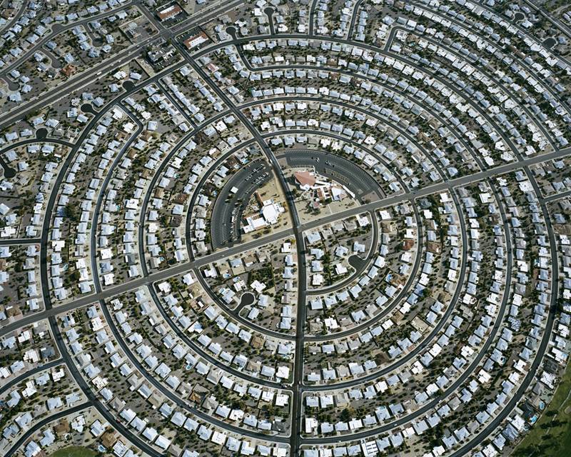
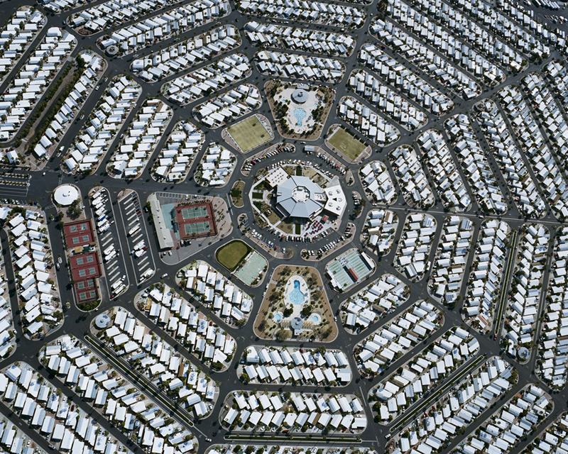
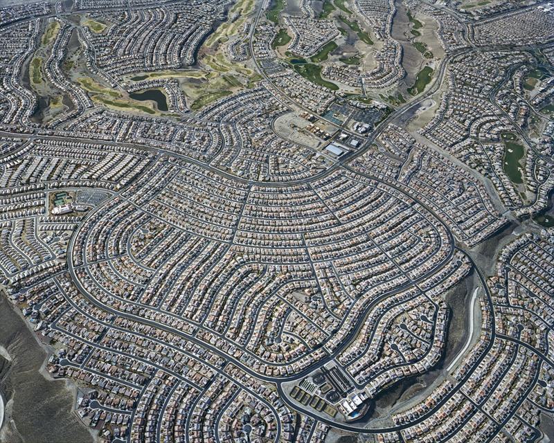
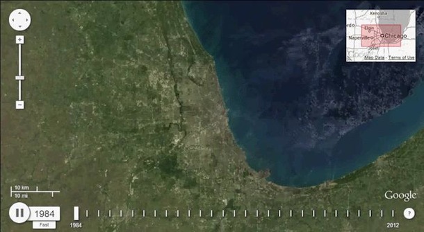
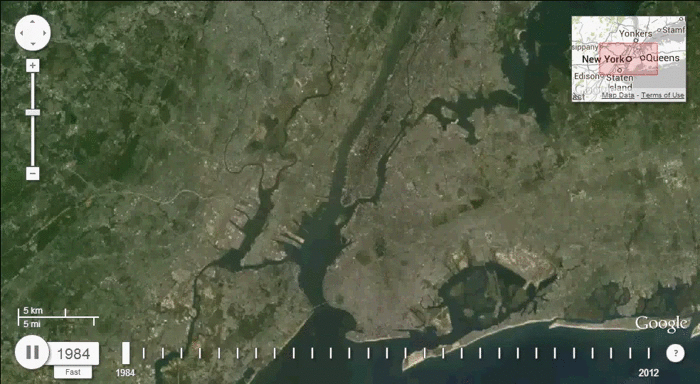
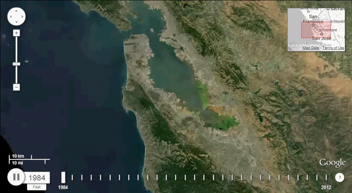
We often talk about housing density. We’re mostly in favor of it. In general, density allows more people to live in less area, resulting in small, efficient homes, walkable/bikable/public-transportation friendly living, more social living (by virtue of being closer to people) and smaller carbon footprint. We also talk about sprawl–density’s counterpart. Sprawl typically entails bigger homes, using up more space, pushing people further afield in socially isolated settings, necessitating more roads, more cars, more carbon, more everything basically.

We tend to frame the density issue in terms of housing size, because it’s easy to understand that big homes, as a rule, reduce overall density. But there is something else, just as important as housing size, that must be factored in to understand how density works, and that is household size.

Household size, as one might imagine, refers to the number of people that inhabit a given dwelling unit. If a six person family lives in one house, that’s a six person household. Without household size, it’s almost impossible to understand density. For example, if that six-person household occupies a 1,000 sq ft house, that’s 166 sq ft/person–a number that could rival any micro-apartment (assuming other factors like lot size, foot area ratio, etc are the same).

It’s important to understand household size, because across the globe, the numbers are shrinking, resulting in more houses and less density.

Let’s look at the United States to illustrate. In 1950, the average household contained 3.37 people. Today, that number is 2.6. In 1950, the average new house was 983 sq ft, or 291 sq ft/person based on the household size. The average new house in 2012 was just over 2500 sq ft, or 961 sq ft/person.

It’s not just the Americans for once. All across the globe–in both developed and developing nations–household numbers are shrinking. For example, the European average is down to about 2.5 people/household–half as many as 100 years ago.

household-size

According to a new paper in the journal Population and Environment there are a number of culprits:

Household proliferation is also due to aging, increasing divorce rates, and decreasing incidence of multigenerational households, which may be partly attributable to changing preferences for privacy. Indeed, the number of households may grow globally despite population numbers stabilizing. According to convergence theory, household size decreases (often from >5 to <3) as a society undergoes urbanization and industrialization. This trend largely occurred in developed nations during the latter part of the 1800s. If convergence theory applies to today’s developing nations, billions of households could be formed despite declines in population growth.

Mason Bradbury, one of the aforementioned papers’ authors, gives an idea of what this decreased household number could mean in terms of numbers:

From a more simplistic perspective, declining household sizes, from over 5 to approximately 2.5, will mean approximately twice as many houses will be needed per capita in any areas of the world yet to undergo the shift in household size. If the average household size had been 2.5 people globally in 2010 [developing nations still boast larger household sizes], then the number of households would have been 41% higher, resulting in 800 million additional households…

And according to Atlantic Cities, more homes have more demands:

That’s also 800 million more refrigerators and ovens and climate-control systems, 800 million more homes that need roads and sewage hookups and access to a power grid. If every one of those homes were the size of the average American home circa 2002, the researchers calculate that would mean constructing about 72,000 square miles of new housing on the planet.

As a small space design blog, we’d be remiss if we didn’t mention that the amount of sprawl (i.e. the 72K sq miles) they calculate is based on a house size of 2509 sq ft–McMansions for all.

Which leads to the question of possible ways forward. We see three:

  1. Let things remain the same. Encroach on undeveloped lands and deplete all natural resources until the planet’s homeostatic environmental mechanisms are irrevocably destroyed.
  2. Reverse demographic shifts away from industrialization, the desire for privacy, divorce and so forth.
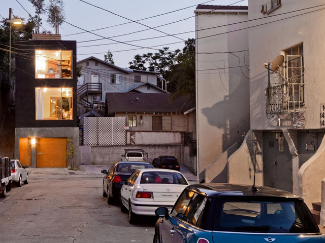
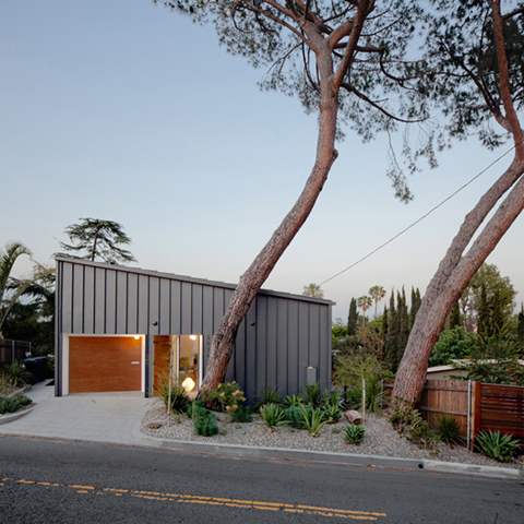
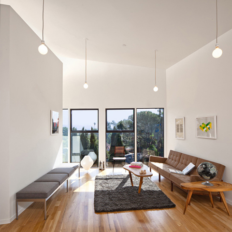
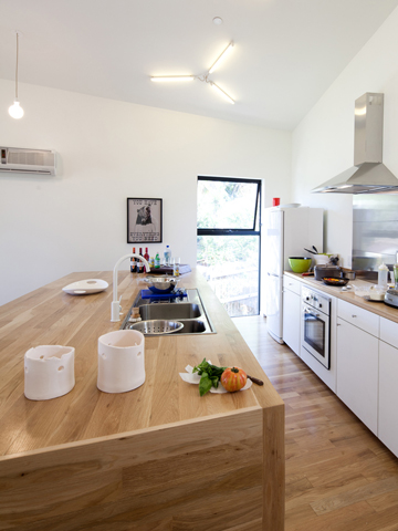
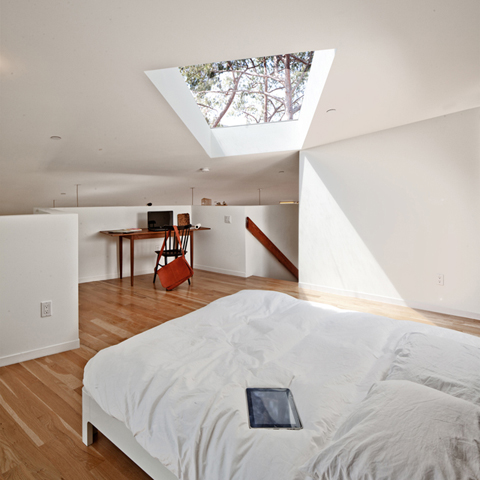
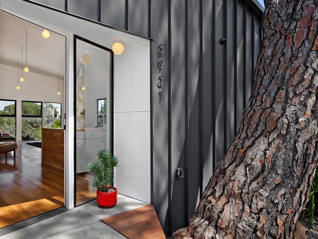
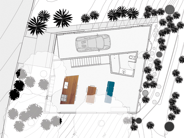
  3. Rethink housing. Adjust housing style to meet demographic shifts. Have smaller, more efficient houses with shared amenities. Creatively subdivide existing housing. Mitigate sprawl by keeping density high, even outside of major metropolises, permitting walk/bike/public transportation-friendly living.

Options #1 and 2 seem like a stretch, so it could be time to start making houses that meet the needs of today’s smaller households.

Happy Family image via Shutterstock

Via Atlantic Cities

Misery, Apparently, Does Not Love Company

Thinking of moving to the burbs or the country? Want a little more room to spread out and raise the kids? Want to feel safer and more secure than you do on the city’s mean streets? Well, you might want to think again. A growing body of research suggests that moving away from the city may be a move fraught with peril and insecurity. Here are some of the possible threats of moving out of town:

Suicide. A paper by Cornell researchers has found a strong correlation between low density and suicide, particularly for people aged 15-19 as the below chart suggests.

suicide-sprawl

This correlation holds true almost everywhere around the world. Countries such as France, Canada and Japan showed a similar connection between suicide rates and density.

Though there is no definitive explanation for why this is the case, an article in Atlantic Cities speculates that the reason is akin to the biological phenomenon called apoptosis, where cells “isolated from the group begin to self-destruct.”

Death. Many people’s notion of the city is forever associated with Charles Bronson riding the 1 Train at midnight. If we just escape to the bucolic burbs or countryside, where people trade their switchblades for hedge-clippers, we will be safe. Not so says a study by researchers from the University of Pennsylvania and the Children’s Hospital of Philadelphia.

polulation-densitydensity-violent-death

While certain urban environs have significantly higher homicide-related death rates than the national average, the overall likelihood of non-illness-related death are considerably higher outside the city, as another Atlantic Cities article reports:

That risk [of dying from urban homicide] is far outweighed by the fact that you’re about twice as likely to die in a car crash in rural America than you are in the most urban counties. Nationwide, the rate of “unintentional-injury death” – car crashes, drownings, falls, machinery accidents and the like – is about 15 times the rate of homicide death. Add together all the ways in which you might die prematurely by intentional or unintentional injury (as opposed to illness), and your risk of death is actually about 22 percent higher in the most rural counties in America than in the most urban ones.

Upward mobility. A NY Times editorial by Paul Krugman called “Stranded by Sprawl” suggests a third threat of moving to the outskirts: Unemployment and lack of opportunity.

Citing a new study by the Equality of Opportunity Project, Krugman points at Atlanta, a city he refers to as the “Sultan of Sprawl.”

Though Atlanta has recently experienced an enormous population growth suggestive of an economic boom, its citizens’ likelihood of upward mobility is the same as Detroit, a city whose economic woes have made it the epitome of urban decay. Krugman asks:

So what’s the matter with Atlanta? A new study suggests that the city may just be too spread out, so that job opportunities are literally out of reach for people stranded in the wrong neighborhoods. Sprawl may be killing Horatio Alger.

In other words, what good is opportunity if you can’t get to it?

[divider]

Needless to say, this is not a topic for over-simplification. Not all suburbs or cities are created alike and there is surely a lot of noise in all of these studies.

And we won’t suggest that people only move out of the city to find a better life. Many people are moving to the outskirts because the city centers have become prohibitively expensive.

But there are many who still see the suburbs as havens of safety and security. For them, these studies should provide plenty of food for thought. Maybe it’s safety and opportunity–not misery as always thought–that love company. 

Average Family House image via Shutterstock

Sprawl, Huh! What is it Good For?

Last week we gave a micro view of the embiggened American home. Today, thanks to Google and the US Geological Survey’s Landsat images, we see the macro view. The GIF’s below, made by Texas architect Samuel Aston Williams, show the Houston, Dallas/Fort Worth, Chicago, NYC, San Francisco and Los Angeles metro areas as they grow from 1984-2012. The ever-sprawling burbs look like spilled milk over once-green hinterlands.

Of course the images don’t tell the full picture, e.g. how the increase in sprawl relates to overall US population or how these spread out cities might be the product of an increasingly urban country (in other words, the increased size of one area might translate to a major decrease in another, more remote locale). Nonetheless, these images, coupled with consistent data showing the ballooning American home size, paint a picture of a country that might need a serious edit.

click on image to enlarge

via The Atlantic Cities

AA: Helping Los Angeles with Its Big House Addiction

Los Angeles has a new ally in combatting sprawl. Anonymous Architecture is churning out spaces that are small, useful, affordable and might help reign in the rate of ceaseless residential land expansion.

We came across AA’s “Eel’s Nest” home via Fair Companies; it is AA lead architect Simon Storey’s personal home. He said he was drawn to the land and its home because they were half to a third the price of anything else in the area. The tiny lot–780 sq ft–originally held an even tinier 350 sq ft home.

Storey tore down the old structure and replaced it with a box-shaped 960 sq ft home with two stories, two bedrooms, a garage and roofdeck. The whole project, according to Storey, had a modest budget of $120K. Even though he probably saved a little money on architect fees, this is an impressive sum for building a very attractive and livable house.

AA designed another interesting small space called the BIG and small House on LA’s Mt Washington. The home has a 2500 sq ft lot size, a 900 sq ft house footprint and 1200 sq ft of useable floor space. The idea behind the house was to maximize the feeling of spaciousness by incorporating high ceilings, lots of natural light and maintaining an open floor plan. The very luxe feeling space had a $200K budget. Not cheap–especially for what is essentially a one bedroom house–but far from outrageous considering the innovative design.

If you think these homes aren’t compact, consider these facts from the US Census:

The average new single-family home sold was built on a lot of 16,663 square feet. The average lot size for new homes sold inside metropolitan areas was 15,616 square feet. Outside metropolitan areas, it was 28,768 square feet.

We appreciate that AA’s designs provide interesting and cost-effective architectural solutions to combat urban sprawl, which is typically dominated by huge homes.

Image via Anonymous Architecture