Beautiful and Italian SMEG

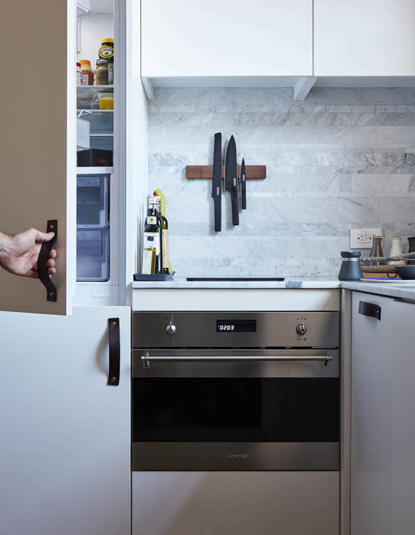
Created with almost all recyclable materials, we love all of the SMEG kitchen appliances in LifeEdited 2. Founded in 1948, SMEG rapidly became a leading appliance manufacturer in post-war Italy, participating in Italy’s “economic miracle” of the 1950s and 60s, when, at one point, Italy became the 3rd largest producer of refrigerators in the world after the US and Japan. Today SMEG integrates technology with design to create detail-oriented products that are both useful and eco friendly.

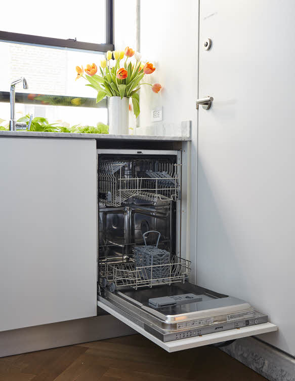
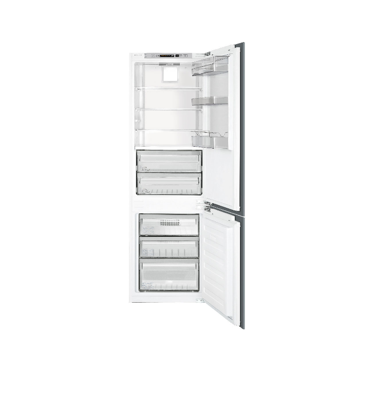
For a small apartment like LifeEdited 2 it is essential to have kitchen appliances that are efficient, but also beautifully designed to blend into a subtle backdrop. Our 24″ Classic Built-in Speed Oven, 18″ Fully Integrated Panel-ready Dishwasher, and 24″ Fully Integrated Panel-ready Refrigerator, allow us to cook sophisticated meals in an eco-friendly manner while maintaining a simple, clean aesthetic.

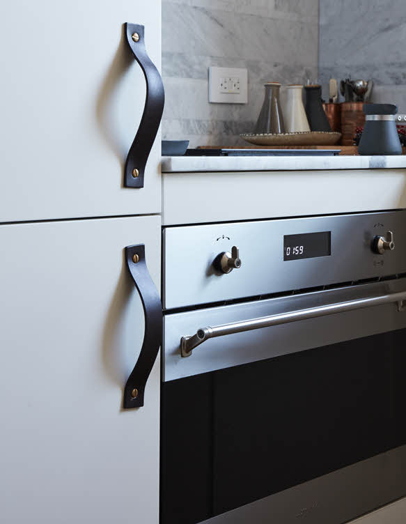
The dishwasher is energy star rated, and all of the appliances have energy saving settings and features. The refrigerator is the right size for us to store enough food for big meals without wasting space and encouraging us to forget about what is fresh. Our favorite feature about the Fully Integrated line is that they are able to be built into cabinets, optimizing visual fluidity throughout the kitchen. As a final touch to our integrated appliances we added MadeMeasure vegetable tanned leather straps for easy use.

For our guide to buying a refrigerator for a small space apartment, follow this link.

This post is one in a series that describes our LifeEdited 2 showcase apartment. LifeEdited 2 embodies our green, space efficient, and minimalist principles. We view LifeEdited 2 as a lab for experiencing things that are consistent with these principles. The product described in this post was given to us, which we appreciate, but we would not have accepted if we didn’t believe in it.

Wood, You Live Well in this Tiny Space (?)

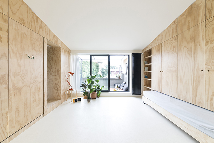
Maybe it’s the sketchy economic climate preventing people from getting fancy lacquered surfaces. Or maybe there’s a wood stain shortage. Or perhaps Lumber Liquidators has been further liquidating. Whatever the reason, cladding apartments with large amounts of naked plywood is a big trend at the moment. This trend has extended to this cool 301 sq ft flat by Milan’s Studio WOK.

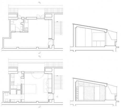
OCS_plan

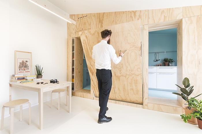
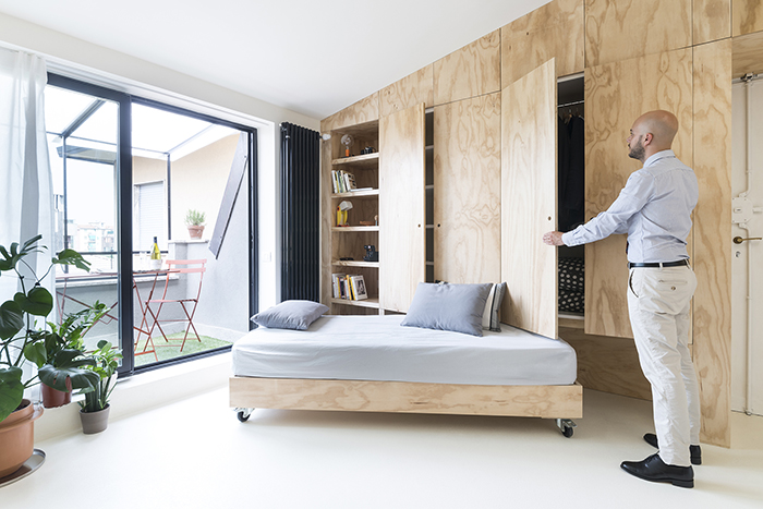
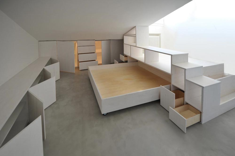
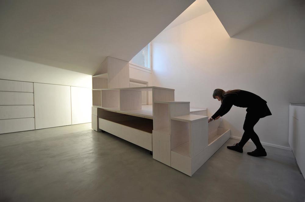
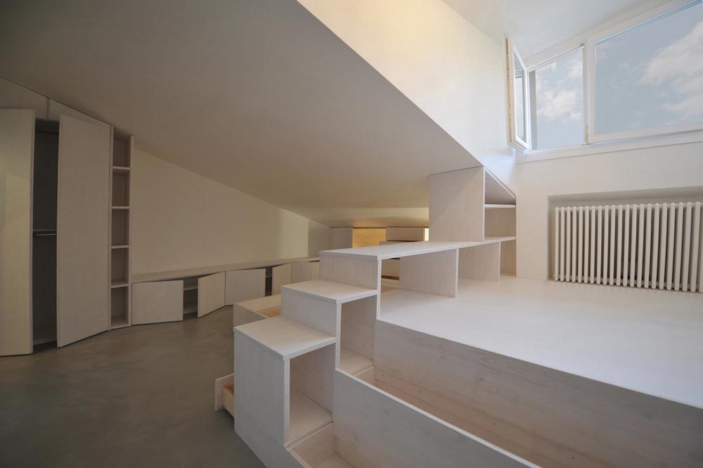
WOK shifted the apartment’s original floorplan, which had a kitchenette in the main room, to have a detached kitchen. This reconfiguration created large walls to build cabinet volumes upon. One wall is dominated by a hiding bed whose faceplate is covered in plywood, of course. That wall also has a host of cabinets to keep things nice and tidy.

The opposing wall has a wardrobe and other storage. At its base is a bed on casters. The wall has a recess that swallows half the bed, creating a sofa surface (I’m assuming the casters lock). Cabinetry on both walls follows the slope of the slanted ceiling, making use of over square foot of possible storage space.

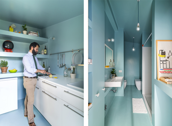
Other than a small turquoise kitchen and bathroom, there’s not too much to the apartment. If I’m not mistaken, most, if not all, of the furnishings and non-plywood cabinetry are from IKEA. There is no published budget, but I’m assuming the renovation didn’t cost a ton of money.

Via Divesare

All images © studioWOK

Idyllic Italian Studio Stuffs Storage in the Floor

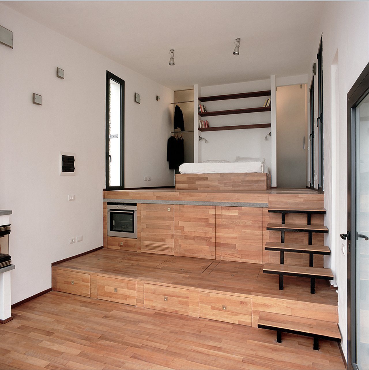
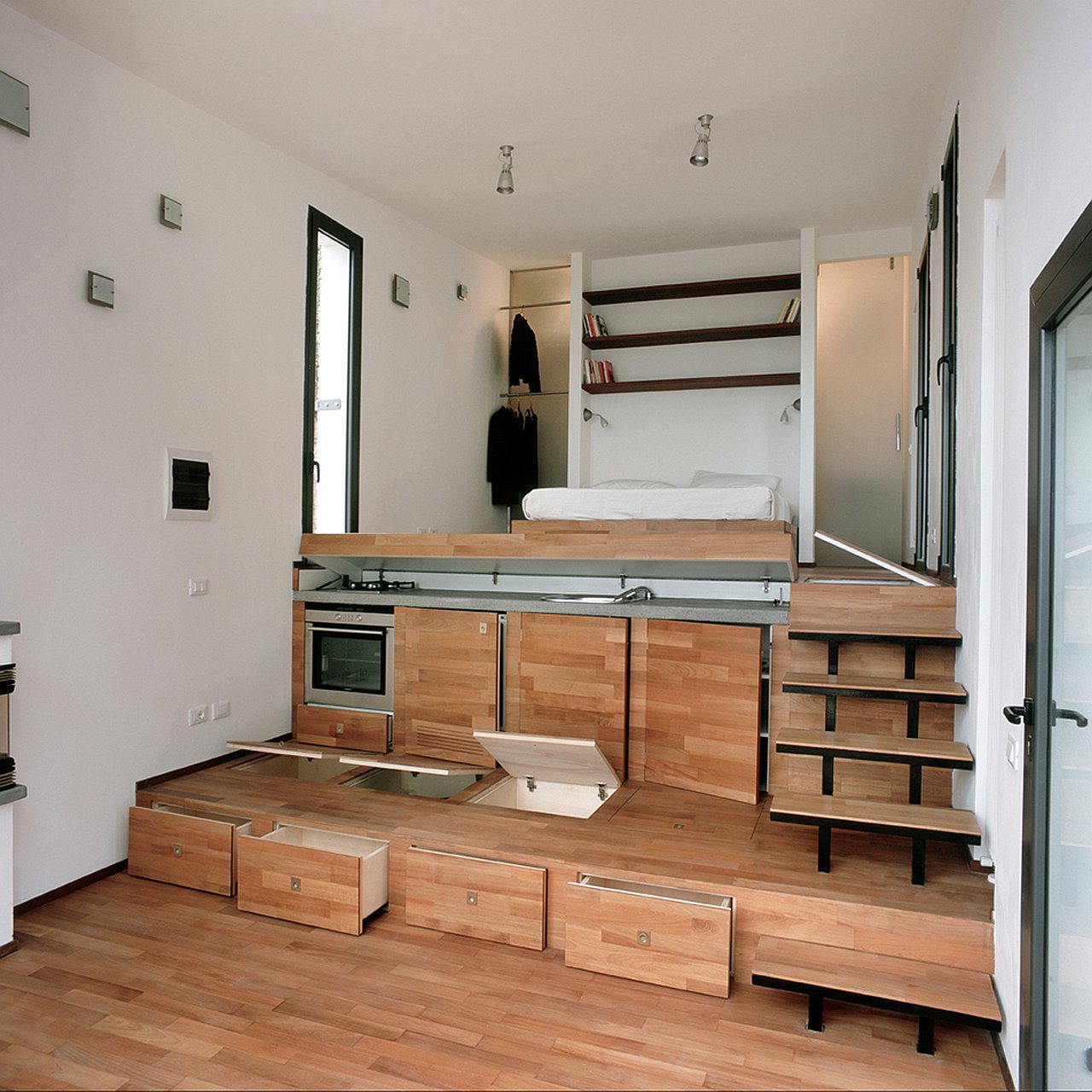
There’s a tendency for small-space designers to go high with storage. And while this is often the best solution, it’s not the only one. This 377 sq ft studio retreat by Italian firm Studioata is a nice example of how storage can be built underfoot as well as overhead.

The studio, which measures 377 sq ft, is built into a hillside in Alassio, Liguria in northern Italy. In fact, the studio’s stepped design follows the slope of the hill, with a bedroom sitting at top, a kitchen in the middle and a lounge area at the bottom. The two steps separating the bed from lounge are packed with function: the first with a hiding kitchen and the second with drawers and underfoot storage containers.

There are a few good reasons why architects don’t design storage under the floor: you must engineer doors that can support the weight of what’s going on above; some people might not like crouching down to get their stuff (though I’d argue it’s easier than getting stuff from up high); and in most situations, adding storage volume down low requires either elevating the whole floor to make a continuous plane or intruding into whatever’s happening below your unit (neighbors, a cellar, etc). But where it makes sense, like here, it makes a lot of sense.

Via Small House Bliss

Oh What A Feeling, When You’re Sleeping on the Ceiling

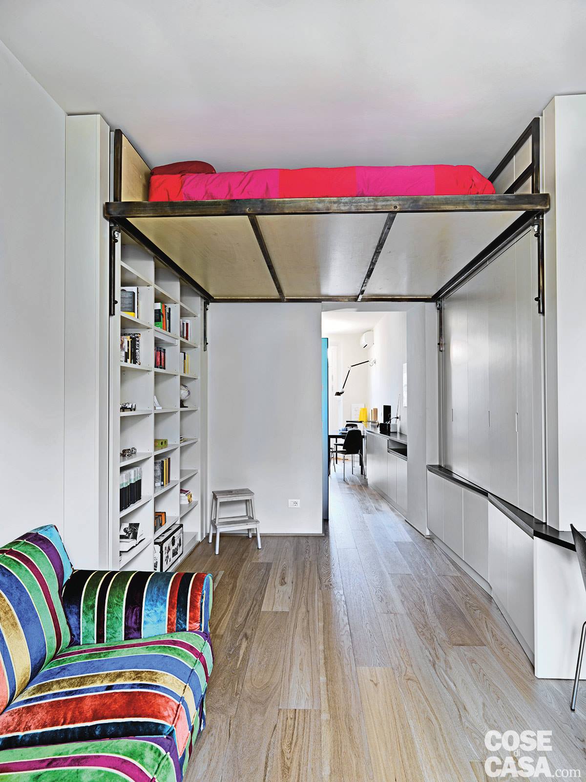
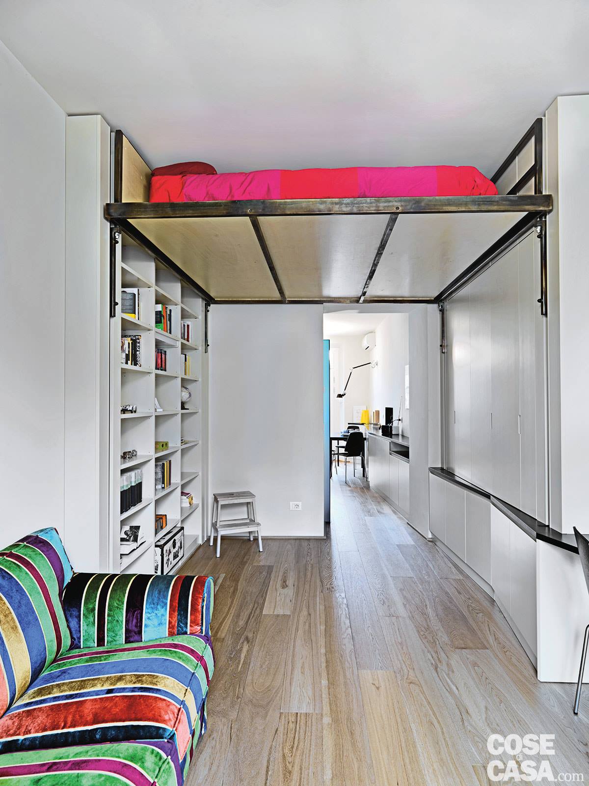
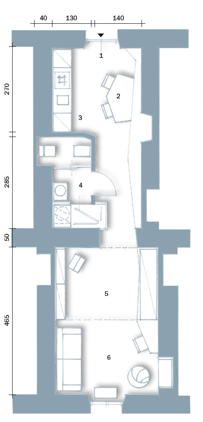
We feature wall beds galore on this site and every now and again we see a trundle bed, but It’s not often that we see beds suspended from the ceiling. Generally speaking, ceiling mounting a bed requires a bit more engineering than other types of hiding beds. The upside (no pun intended) is that the bed doesn’t take up any wall or floor volume–useful in a skinny space with high ceilings. Such is the situation in this 355 sq ft Milanese apartment by architect Tommaso Giunchi.

The custom made bed is manually operated and pulled down standing on a hidden stool. Hiding the bed allows for the bedroom to double as living room during the day.

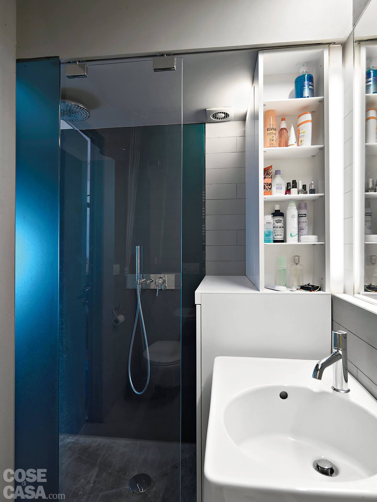
The bed is far from the only feature of the apartment: there is floor-to-ceiling MDF storage through the space, a kitchen featuring a small, fold-out bench and a bathroom that manages to fit a washer dryer in between the shower stall and sink.
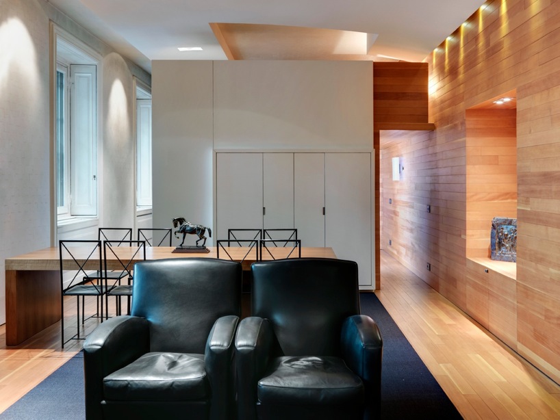
Long and narrow apartments like this one are common throughout the world’s cities (called railroad apartments in the US). We appreciate Giunchi’s innovative approach to furniture design and space layout.

via Cose di Casa

An Attic You Wouldn’t Mind Being Trapped In

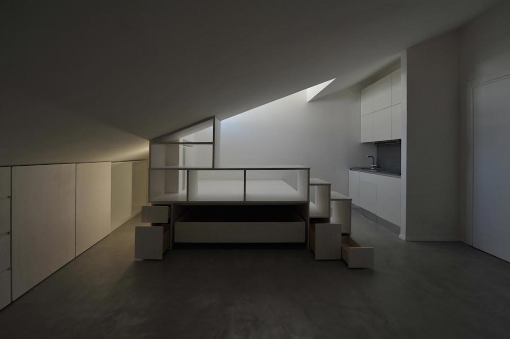
With their sloping roofs and associations with housing unwanted family members, the poor attic has a hard time being recognized as a legitimate place to live. This situation makes Italian architect Michele Gambato’s attic conversion in Padua all the more impressive (full disclosure: it’s a top-floor apartment). Gambato actually made the 258 sq ft space seem pretty livable.

Gambato wanted to divide the tiny space into discreet kitchen, dining, living and sleeping zones. He blocked out the open space using cabintry along the perimeter as well as interior of the space.

michele-gambato-floorplan

The center storage volume houses a trundle bed which can be used as a sofa or bed depending on how far it is extended. Like Anthony Gill’s family apartment, Gambato takes advantage of the volume where the bed is stored, using it as a dining platform, whose height makes it easier to look out the flat’s lone window. All the cabinets are white-washed plywood and the floor is concrete, giving the space a light and open feel. Perhaps if this Gambato had visited the Bates’ household back in the day, things wouldn’t have ended up so poorly.

Thanks for the tip Andrei

Images courtesy of Michele Gambato

Italian Apartment Makes Micro Seem Huge

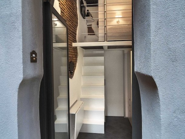
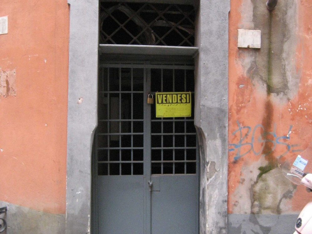
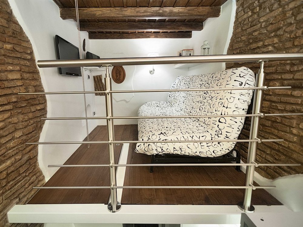
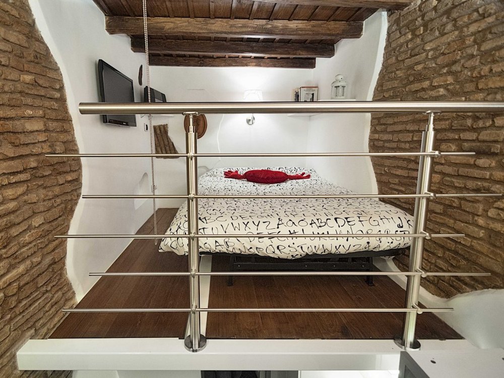
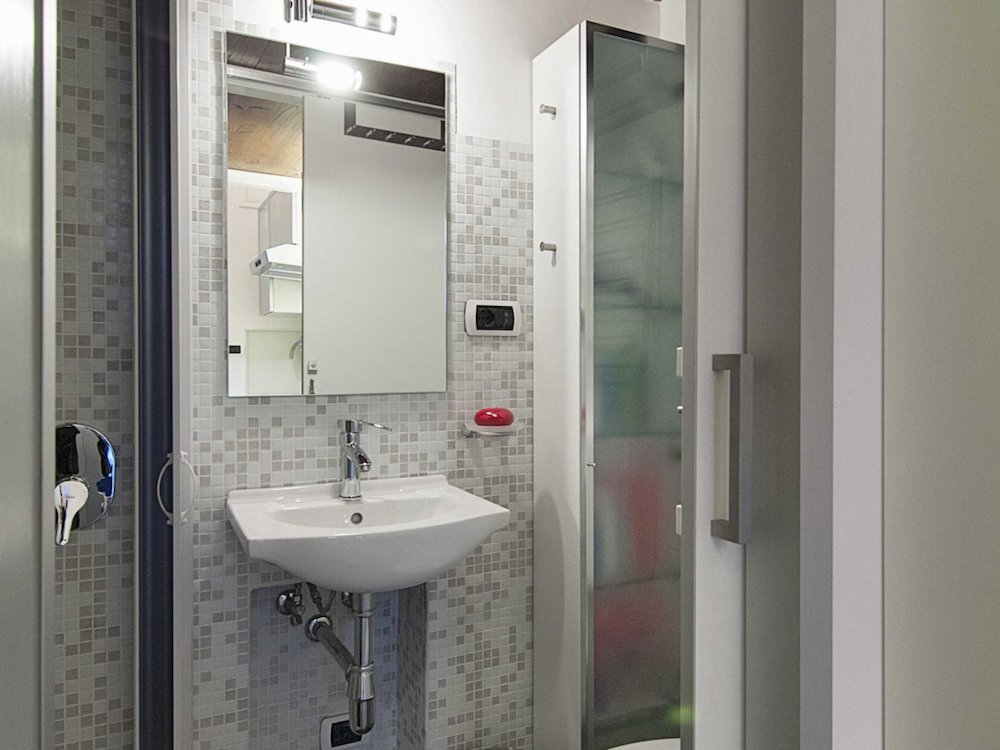
We’ve seen some pretty damn small apartments on this site. There was Felice Cohen’s 90 sq ft studio, Steve Sauer’s 183 sq ft triplex and countless tiny houses, the latter of which rarely break the 200 sq ft mark. But this 75 sq ft apartment in Rome might just take the prize for smallest home we’ve ever seen. The tiny space houses an actual kitchen, bathroom, dining area, a decent amount of storage and a loft for sleeping and lounging loft.

The space, which is minutes from the Pantheon and Saint Peter’s Square, dates from the 1700s. It was sitting fallow for years before architect Marco Pierazzi decided to buy and renovate it. He and his wife lived there before the birth of their child.

The space actually looks fairly livable. The kitchen is surprisingly functional looking. The stair/seat is very clever. The upstairs lounge looks quite cozy. The bed…well the bed might be a nightmare. Given that the opened bed covers the trap door that provides access to the rest of the space (see: bathroom), we wouldn’t want any late-night or early morning trips to the loo. Perhaps this is not an issue for those more gymnastically inclined and can hop over the railing.

While not a someplace I’d want to live in for a sustained period of time, the dinky space is a testament to the power of design, turning a space that most would consider only worthy of housing a dumpster into a pretty functional dwelling.

Via Business Insider

Milanese Flat Shows There’s More than One Way to Chop a Box

Few shapes are easier to work with than the box. Halve it, quarter it, cut it into thirds. But because of these endless possibilities, it can be difficult to choose the best one. In thinking about how to best divide a 624 sq ft apartment in central Milan, architect Daniele Geltrudi looked to early 20th Century architect Adolf Loos for inspiration. Loos had created something called the “Raumplan,” a design that shirks traditional room divisions in favor of flowing, multilevel spaces. Loos said, “For me, there are only contiguous, continual spaces, rooms, anterooms, terraces, etc. Stories merge and spaces relate to each other.” Loos’s philosophy is evident in Geltrudi’s design, which creates a unique flow of spaces with various different levels and chambers.

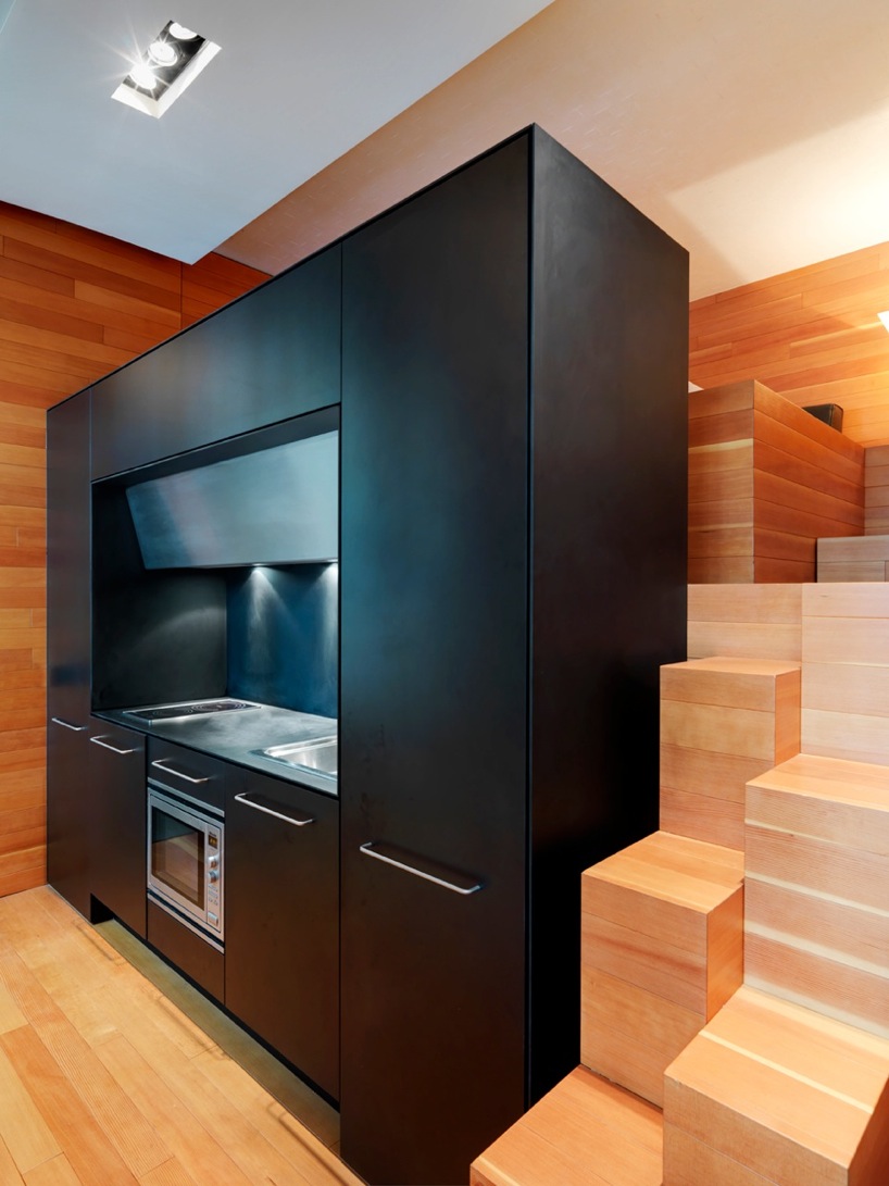
The main space has 12 ft high ceilings, which Geltrudi uses to maximum effect. He installed a large wooden volume that contains the kitchen, a lofted bed and a small chamber underneath which can be used as a study or second bedroom. Because the volume takes up relatively little area (about 176 sq ft), Geltrudi was able to make the living area very spacious and even include a nine foot dining table.

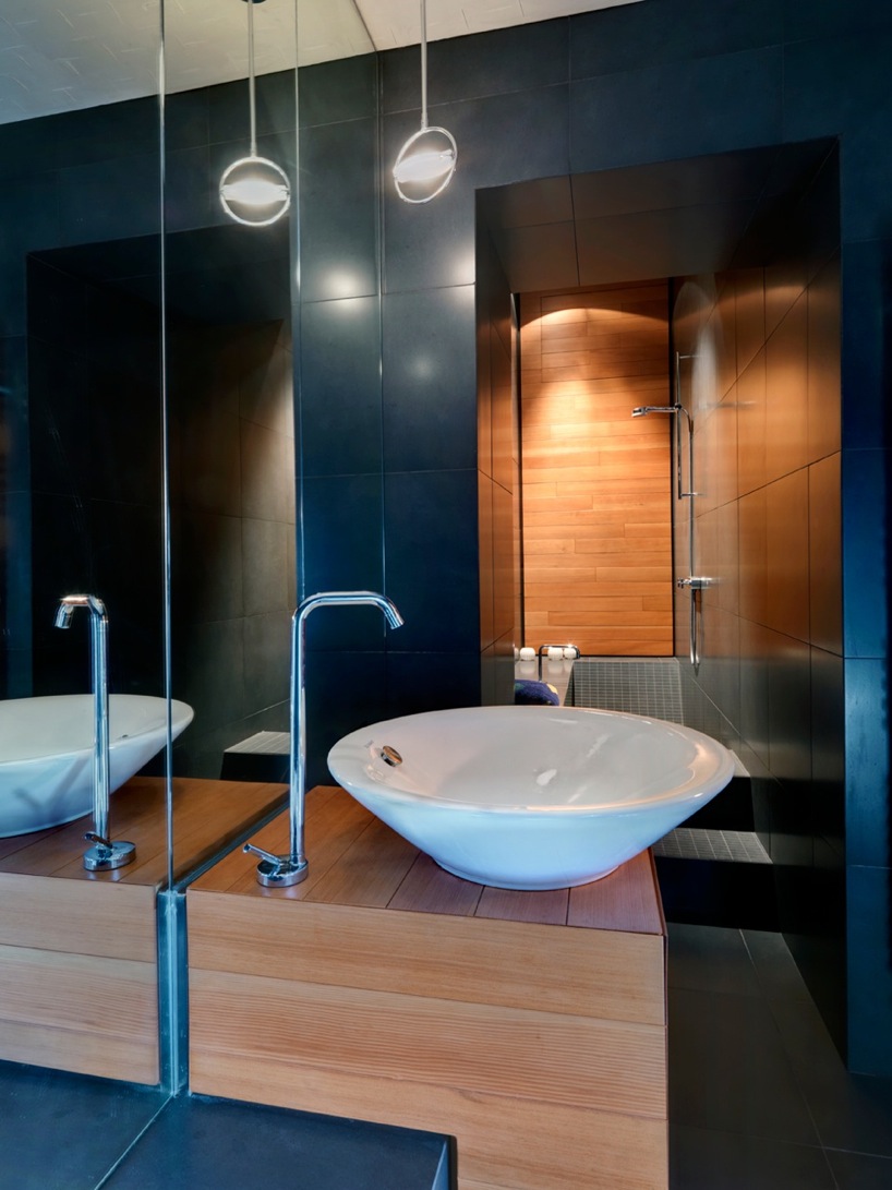
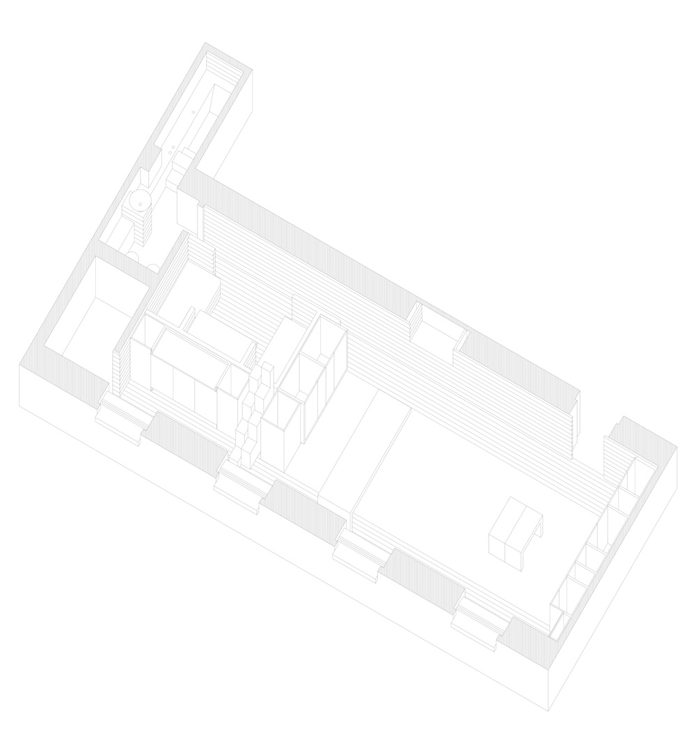
Other features include built-in storage throughout, both built into the douglas fir-paneled walls as well as the wood structure; this ample storage sidesteps the need for most freestanding furniture. There is also a bathroom that creatively squeezes a tub into the long skinny space.

In some ways, the apartment reminds us of a very high end version of Adam Finkelman’s studio conversion we looked at last month. The size and shape of the space is remarkably similar. Both used vertical space to install two bedrooms. The budget…well, we don’t have Geltrudi’s numbers, but we suspect it was slightly north of the one month’s rent Finkelman forked over. I guess the similarities end there.

Fancy and Functional Little Flat by the Sea

The ‘Harbour Attic’ is an apartment designed by Gosplan architects in Camogli, a small seaside village near Genova. The holiday flat began its life as an attic above the old fishermen’s house. The objective of Gosplan’s renovation was to fit two bedrooms, a studio, a living room, kitchen and bathroom into the 35 sq meter (376 sq ft) space. 

Gosplan achieves the high level of functionality through ample use of custom cabinetry. There is a small reading area with a bed hidden beneath a cantilevered door; the space is also closable with a curtain. There is a separate master bed lined with built-in cabinetry providing tons of storage. There is a concealed kitchen that masks the fact it’s there when not in use–useful in small rooms that do double and triple duty. There is a tiny sitting nook in one of the windows that looks out at the sea. The living room has a comfy looking built in sofa and a conventional table so the place doesn’t look completely space-age.

With a consistent color palette and fancy custom cabinetry, the place has a pretty posh look about it. And the sparse décor suggests the owner did not feel the need to shoehorn aunt Trudy’s armoire into the living room. Nevertheless, the space–greatly enhanced by seaside vistas–is pretty gorgeous and seems functional enough to live in year-round.

Via Ignant

All images © Anna Positano

1984 Italian Comedy at the Vanguard of Transforming Design

In the 1984 Italian comedy “Il Ragazzo di Campagna” (The Country Boy), the movie’s protagonist moves into an amazing tiny apartment that, upon initial inspection, looks like a closet, but as the realtor in the scene above reveals, is actually a studio apartment with hidden kitchen, bathroom, entertainment center and bedroom.

The apartment–based on a rudimentary translation done with Spanish/Italian cognates–is meant to show the exploitive and rapacious nature of urban real estate, similar to the King’s Cross video we looked at a while back. While there’s a lot of that going on for sure, we actually find it a cool demonstration of an apartment that does everything in very tight quarters. Could probably use a window or two.