
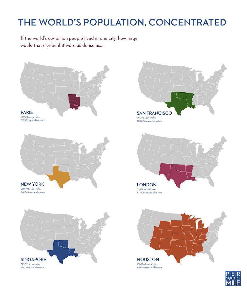
The above infographic from a project called Per Square Mile shows how much landmass the world’s 7B inhabitants would occupy if they achieved the housing density of various cities. Paris came in at #1; those 7B could live on a mere 128K sq miles of land–approximately the size of Arkansas, Louisiana and Mississippi. New York City achieved a competitive 250K sq miles–about the size of Texas. Houston–often the whipping boy of urban sprawl–fit the world’s population into a more spacious 1.8M sq miles.
Seven billion is a whole heck of a lot of people, but this infographic shows that there is room enough for everyone to live. Density is a great place to start.
But density doesn’t tell the whole story. Tim De Chant, the man behind Per Square Mile, received a lot of comments about what the map doesn’t show: The landmass needed to support various populations based on their consumption of resources. De Chant made the below infographic to fix that missing information.
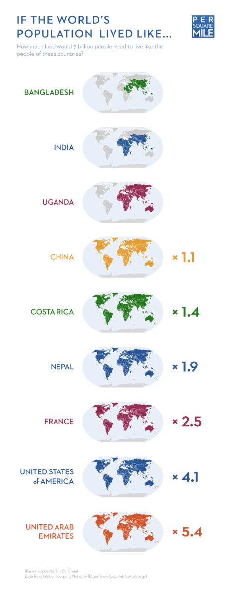
This shows a very different picture. It show that the “developed” world uses a crazy amount of resources–far more than the planet can sustainably provide. For example, the US uses four earths to fuel its lifestyle.
It’s probable that populations of areas where great density is achieved, like NYC and Paris, while achieving far greater levels of efficiency than their suburban countryman, still consume close to or more resources than the earth can provide (De Chant lacked data to tally individual city’s energy needs). In other words, density is necessary to fit everyone on the planet, but not sufficient. Architecture, design, planning and behavior must go hand-in-hand.
What do you think of these figures? Do you see flaws? Do you see a way out? We’d love to hear what you think.
via Per Square Mile